Did you know the right home decor color schemes can really change how your rooms feel? A good color palette can make a room feel welcoming and unique.
We’ll show you how to make a beautiful color palette for your home interior. It will show off your style and make your home even more stunning.
Creating a color palette is more than just picking colors. It’s about making a space that shows who you are and your style.
Key Takeaways
- Learn the basics of color theory and how it applies to home decor.
- Find out how to pick a color scheme that fits your life and taste.
- Get tips on mixing colors to create harmony in your home.
- See different decorating styles and the colors they use.
- Discover how to add your personal touch to your home’s colors.
Understanding the Importance of a Color Palette
The colors we pick for our homes greatly affect the feel and look of our spaces. A well-chosen color palette can make a room look better and feel more welcoming.
Why Color Matters in Interior Design
Color is key in interior design, affecting how a space looks and feels. It can change our mood and emotions. So, picking the right colors is very important.
Colors can change our mood and behavior. Warm colors like reds and oranges bring energy. Cool colors like blues and greens calm us down.
The Psychology of Color
The study of color psychology is complex. It looks at how colors affect our feelings and actions. In design, knowing this is vital for creating spaces that are both beautiful and good for our health.
For example, blue is linked to calmness and peace. It’s a great choice for bedrooms and bathrooms where we want to relax.
Creating a Cohesive Atmosphere
A unified color palette is key for a room that looks and feels good. By picking colors that work well together, we can make our spaces feel connected and peaceful.
To get this unity, start with a main color. Then, choose secondary and accent colors that add to it. This way, you get a balanced and harmonious look.
Key Elements of a Color Palette
Understanding a color palette is key for interior design. When picking paint colors for home, it’s more than just favorites. It’s about creating a harmonious look.
Let’s look at the main parts of a color palette. These include primary, secondary, and accent colors, plus neutral shades.
Primary, Secondary, and Accent Colors
A good color palette has a primary color, secondary colors, and accent colors. The primary color is the main color that sets the mood. Secondary colors complement the primary and add depth. Accent colors add a pop and interest.
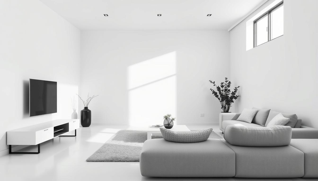
Neutral Shades and Their Role
Neutral shades are key in balancing a color palette. They ground the space and prevent colors from feeling too much. Beige, gray, and taupe are common neutrals. They can support bold colors or create a calm atmosphere.
Color Combinations That Work
For coordinating colors for home decor, some combinations are great. Here are a few:
| Color Combination | Description | Best Used In |
|---|---|---|
| Monochromatic | Different shades of the same color | Bedrooms, living rooms |
| Complementary | Colors opposite each other on the color wheel | Playrooms, kitchens |
| Analogous | Colors next to each other on the color wheel | Living rooms, dining rooms |
Knowing these elements helps you create a color palette that makes your home look better.
Choosing a Color Scheme for Different Spaces
Different rooms have different uses, and the right colors can make them better. The colors you pick for your living room won’t be the same as your bedroom or dining area. Each room needs its own special colors to meet its needs.
Living Room Color Ideas
The living room is the heart of the home, where you relax and socialize. For a lively room, think about colors that make you want to talk and feel at ease. Beige, taupe, or gray can be a calm base. Then, add fun colors with furniture or art.
Bedroom Serenity through Color
Bedrooms are places for rest and calm. Soft, calming colors like light blues, pale greens, or muted grays help you relax. Think about the light and your furniture when picking colors for a peaceful room.
Dining Area Warmth and Inviting Colors
The dining area is where you make memories. Warm colors like terracotta, golden brown, or deep reds make you hungry and talkative. Use these colors on walls, furniture, or decorations to make it cozy.
| Room | Recommended Colors | Effect |
|---|---|---|
| Living Room | Beige, Taupe, Gray with pops of color | Stimulates conversation and comfort |
| Bedroom | Light Blues, Pale Greens, Muted Grays | Promotes serenity and rest |
| Dining Area | Terracotta, Golden Brown, Deep Reds | Creates a cozy, inviting ambiance |
Choosing the right colors for each room makes your home better. It makes your home more fun and peaceful.
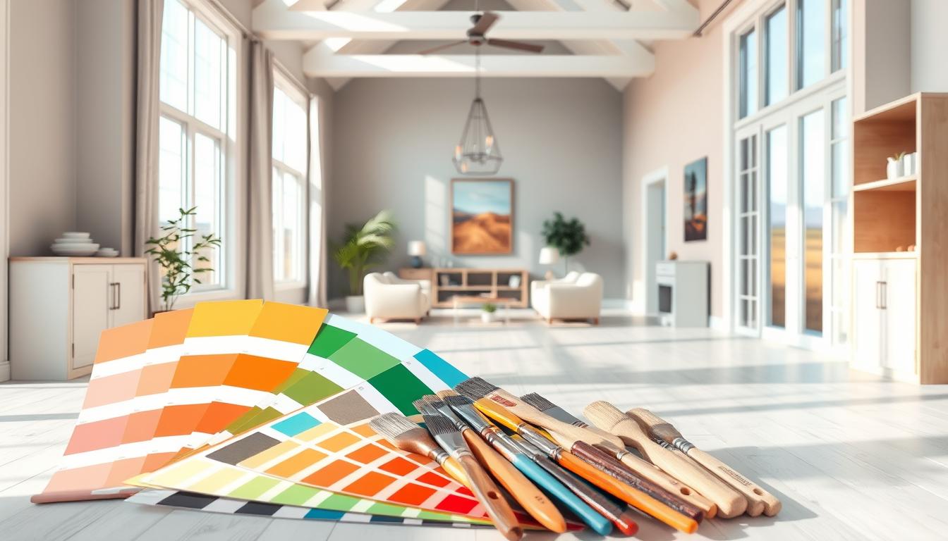
Tools and Resources for Color Selection
Choosing the right color palette for your home can be tough. But, many tools and resources make it easier. With these, you can explore many colors and find the perfect match for your taste and decor.
Online Color Palette Generators
Online color palette generators have changed how we pick colors for our homes. These tools let you input your favorite colors or start fresh. They create harmonious palettes. Adobe Color and Coolors are popular for their wide range of palettes and export options.
Color Swatches vs. Digital Tools
Digital tools are handy and offer lots of options. But, color swatches give a real feel of colors. They show how colors look in different lights and with various materials.
On the other hand, digital tools let you see color interactions in real-time. You can make changes quickly. Using both can give you a full picture of your color palette.
Apps for Visualizing Colors
Apps like Color Hunt and Paint My Wall help you see colors in your space. You can upload a room photo and try different colors. It’s a fun way to test color schemes without painting.
Using these tools and resources helps you choose a color palette wisely. This ensures your home looks beautiful and works well.
Inspiring Color Trends for 2023
2023 is set to be a colorful year for interior design. We’ll see everything from earthy tones to bold, vibrant colors. These trends aim to make our spaces both personal and eye-catching.
Earthy Tones and Natural Hues
Earthy tones and natural hues are back in style for 2023. They add warmth and coziness, connecting us to nature. Colors like terracotta, sage green, and sandy beige create welcoming spaces.
Earth tones are great for any style, from modern to traditional. They can be the main color or an accent, adding depth and charm.
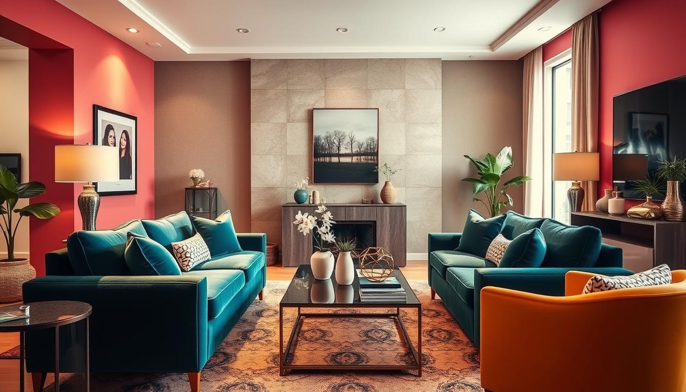
Bold, Vibrant Colors
Bold and vibrant colors are big for 2023. Think fiery reds and electric blues. These colors add personality and energy to rooms. It’s key to balance them with neutral shades to avoid too much.
Designer Kelly Wearstler said,
“Color is a powerful tool, and when used correctly, it can completely transform a space.”
This is very true for bold colors. They can make a room stand out.
Soft Pastels for a Modern Touch
Soft pastels are also trending in 2023. These soft, soothing colors add modern elegance. Shades like blush pink, lavender, and mint green are used in walls, furniture, and decor.
To use soft pastels, pair them with crisp whites or light woods. This creates a balanced and harmonious look.
Using Color to Enhance Room Functionality
The right colors can change a room, making it more useful and beautiful. When choosing paint colors for home, think about the room’s purpose. How color can make it better is key.
Colors greatly affect a room’s feel and use. For example, bright colors can make small rooms look bigger. Calming colors can make home offices peaceful.
Bright Colors for Smaller Spaces
Bright colors in small rooms can make them seem bigger. “Light colors on walls and ceilings can make a room feel more spacious and airy,” say interior design experts. We can use white, cream, or light pastels for this.

Calming Colors in Home Offices
In home offices, calm colors help focus and work better. Soft blues, pale greens, and neutral tones are great for a peaceful work area. They reduce eye strain and bring calm.
Layering Colors for Depth
Layering colors adds depth and interest to a room. Mixing a main color with secondary and accent colors makes a space lively. For example, a bold wall color with neutral furniture and decor creates a strong contrast.
When picking choosing paint colors for home, remember to balance colors with the room’s purpose and your taste.
Common Mistakes to Avoid When Choosing Colors
Choosing colors for your home can be tough. Knowing common mistakes helps a lot. It’s easy to make choices that mess up your space’s look.
To make your home look good, you need to think about a few things. Here are some big mistakes to avoid:
Overusing a Color
Using one color too much makes a room feel dull. It’s good to have a theme, but balance is important. Mix different shades and tones to make your space interesting.
Ignoring Lighting Effects
Lighting changes how colors look in your home. Natural light and artificial light both play a part. Make sure to check how your colors look in different lights.
Forcing Colors That Don’t Flow
Not all colors go together. Forcing colors that clash can ruin the feel of your space. Use color theory to pick colors that work well together.
By avoiding these mistakes, you can pick colors that make your home beautiful. The goal is to create a space that feels welcoming and shows off your style.
How to Test Colors in Your Space
Before you pick your colors, test them in your space. This step is key to making sure the colors look good together. It also checks how they match your home’s lighting.
Testing colors means more than just looking at paint swatches. You need to see how they work with your furniture, floors, and lighting. Color theory in interior design stresses the need to think about these things. This helps create a space that looks and feels right.
Sample Swatches and Paint Testers
Sample swatches and paint testers are great for testing colors. They let you see how shades look on real walls. Pick a few swatches for your main, secondary, and accent colors.
Apply these swatches to different walls. See how they look at different times and under different lights.

Assessing Colors in Different Lighting
Lighting changes how colors look in your home. Natural light shifts, and artificial light adds its own color. It’s important to see your colors under both types of light.
Try using LED bulbs that mimic natural daylight. This helps you see your colors more accurately.
Viewing Colors at Different Times of Day
Colors change with the light of day. A color might look great in the morning but different at night. To really see your colors, check them at morning, afternoon, and evening.
By testing your colors carefully, you can make sure they improve your home’s look and feel. The goal is to create a space that feels welcoming and shows off your style.
Bringing Your Color Palette to Life
Now that you have your home decor color schemes, let’s explore how to make them shine in your living space. It’s not just about painting the walls. It’s about creating a cohesive look throughout your home.
Accessorizing with Textiles and Decor
Textiles and decor are key in enhancing your chosen color palette. We can use throw pillows, blankets, and rugs in colors that complement our palette. For example, throw pillows in varying shades of blue can add depth and interest to a calming blue living room.
Tips for Accessorizing:
- Choose textiles that reflect your color palette.
- Mix patterns and textures to add visual interest.
- Use decorative items like vases and sculptures to add pops of color.
Paint Finishes and Their Impact
The finish of your paint can significantly impact the overall look and feel of your space. Different paint finishes can enhance or detract from your color palette. For example, a matte finish can create a sophisticated, understated look, while a glossy finish can add a touch of elegance and sophistication.
| Paint Finish | Description | Ideal Use |
|---|---|---|
| Matte | Flat, non-reflective finish | Ceilings, low-traffic areas |
| Eggshell | Slightly higher sheen than matte | Living rooms, bedrooms |
| Satin | Soft, warm sheen | High-traffic areas, trim |
| Glossy | Highly reflective finish | Doors, trim, accents |
Incorporating Art into Your Color Scheme
Incorporating art into your home can be a wonderful way to enhance your color palette. Artwork can add personality and style to your space. When chosen thoughtfully, it can tie together different elements of your decor.
When selecting art, consider:
- The colors and how they interact with your palette.
- The style and theme of the artwork and how it fits with your decor.
- The size and scale of the piece in relation to your walls and furniture.
By thoughtfully accessorizing with textiles and decor, choosing the right paint finishes, and incorporating art into your color scheme, you can bring your home decor color schemes to life. This creates a beautiful, cohesive space.
Maintaining Balance in Your Color Palette
To keep your home looking good, balance in your color palette is key. A balanced color scheme makes your living spaces more inviting. It creates a visually appealing atmosphere.
Effective Color Distribution
Spreading colors evenly in your spaces is crucial for a cohesive look. Using popular interior paint colors in different rooms helps. Choosing a few core colors and using them in various rooms ties your home together.
Seasonal Refresh with Accessories
Changing accessories with the seasons is a smart way to update your decor. Swapping out throw pillows, rugs, and other items with seasonal colors keeps your living room fresh. It brings in new color combinations for living room.
Personal Style Consistency
Staying true to your personal style is important when keeping your color palette. Adding elements that show your taste makes your home a true reflection of you. This makes your space feel more welcoming and authentic.