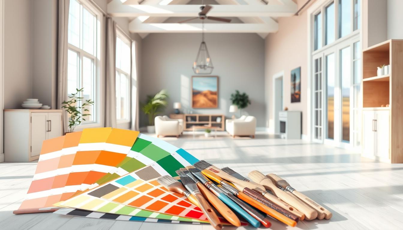
Did you know the right color palette can change your living space? A good palette makes your home warm and welcoming, showing off your style. We’ll show you how to find color combinations that make your home decor stand out.
Choosing the perfect colors can feel like a big task. We’ll help you through it. You’ll learn how to make a space that looks good and feels right.
Key Takeaways
- Understand the basics of color theory
- Learn how to choose a color palette that suits your style
- Discover how to balance different colors
- Explore the role of neutral colors in interior design
- Get tips on how to add a pop of color to your space
Understanding the Psychology of Color in Interior Design
Color psychology is key in interior design. It shapes how we feel and interact in our homes. Choosing the right colors can make a room look better, affect our mood, and even change our behavior.
The Impact of Colors on Mood
Colors deeply influence our mood and emotions. For example, blue tones bring calmness and serenity, perfect for bedrooms. In contrast, warm colors like orange and red boost energy, fitting well in living rooms.
Choosing Colors Based on Purpose
Each room has its own purpose, and colors should match. A home office might need focus-enhancing colors like green. Bedrooms, on the other hand, should use softer colors for better sleep.
Warm vs. Cool Colors
The warm vs. cool color debate is big in design. Warm colors make spaces cozy and inviting. Cool colors, by contrast, can make rooms feel larger and calmer. Knowing these effects is key to setting the right mood in your home.
When picking a color scheme, think about:
- The room’s purpose
- The natural light it gets
- The colors of furniture and decor
- The room’s overall style or theme
For more tips on picking the right colors, check out our guide on choosing the best home interior colors.
Understanding color psychology and the purpose of each room helps homeowners make smart color choices. This knowledge, along with staying up-to-date on color trends, leads to spaces that are both stunning and practical.
Popular Color Trends for Home Interiors
Keeping up with color trends is key for homeowners wanting to update their homes. We’re seeing a variety of popular home color palettes that each bring their own style.
Interior design is all about natural colors, bold statements, and calming neutrals. Let’s look at these trends in more detail.
Earthy Tones
Earthy tones are in, adding warmth and coziness to homes. These colors, inspired by nature, include terracotta, sienna, and moss. You can use them in paint, furniture, and decor.
- Terracotta and sienna create a welcoming feel in rooms.
- Moss and sage greens bring a natural vibe, promoting calm.
- Combining earthy tones with neutrals makes for a balanced look.
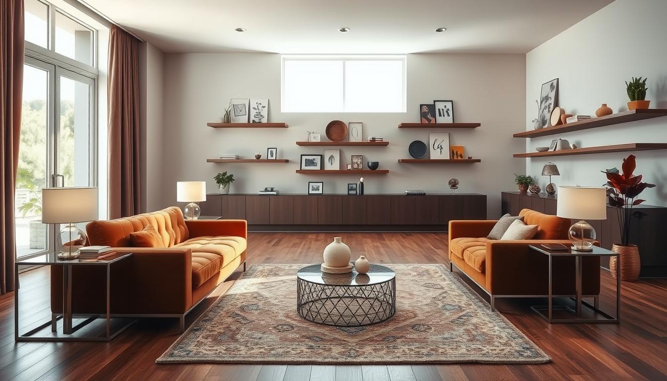
Bold Accent Colors
Bold accent colors are perfect for adding personality to a room. Deep blues, emerald greens, and bright yellows can be used in accessories or furniture to draw attention.
- Deep blues add elegance and sophistication.
- Emerald greens make a room feel luxurious, ideal for statement pieces.
- Vibrant yellows can make a room feel happy and lively.
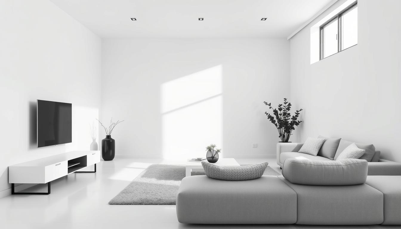
Soft Neutrals
Soft neutrals are still a favorite in home design, offering versatility and lasting appeal. Shades like white, beige, and soft gray can create a clean, minimalist look. Or, they can be layered for more depth and interest.
Using soft neutrals as a base makes it easy to add bolder colors through decor. This way, you can easily change up your room’s look with the seasons.
Creating a Cohesive Color Palette
A well-designed color scheme can make your home feel more welcoming. It’s key to have a cohesive color palette for a harmonious look. We’ll look at a simple rule and tips for mixing colors.
The 60-30-10 Rule Explained
The 60-30-10 rule is a classic in interior design. It says 60% of the room should be a main color, 30% a secondary color, and 10% an accent color. This rule makes your space look balanced and beautiful.
To use this rule, pick a main color for your walls (60%). Then, choose a secondary color for furniture and decor (30%). Add an accent color with accessories like throw pillows or vases (10%).
Tips for Mixing and Matching Colors
Mixing colors can be tricky, but with some tips, you can create a stunning palette. Here are some suggestions:
- Start with a neutral base and add pops of color through accessories.
- Use a color wheel to find harmonious color combinations.
- Consider the natural light in your room and how it affects the colors.
- Don’t be afraid to experiment and adjust your color palette as needed.
Importance of Texture
Texture is key in enhancing your color scheme. Mixing different textures adds depth and interest to your space. Try combining smooth surfaces with rough textures, or matte finishes with glossy ones.
For example, pair a smooth leather sofa with a rough-textured rug. Add some glossy decorative accents. This mix of textures makes your home feel rich and engaging.
Color Combinations for Different Rooms
Color combinations are key in interior design. They define each room’s character. Different rooms need different colors to work well and feel right.

Living Room Inspirations
The living room is where we relax and have fun. It’s important to choose warm colors for a cozy feel. Here are some good options:
- Beige and brown with deep reds or oranges for warmth.
- Soft grays and creams with rich wood tones for elegance.
- Bold colors like turquoise or yellow for fun.
Bedroom Serenity
Bedrooms are our rest spots. They should feel calm and peaceful. Think about these colors:
- Soft blues and pale lavenders for calm.
- Mint greens and creamy whites for freshness.
- Muted grays and taupe for elegance.
Interior design experts say a calm bedroom needs balanced colors.
Kitchen Brightness
Kitchens are where we make memories. They should be bright and welcoming. Here are some ideas:
- Crisp whites and stainless steel with bright yellows or reds.
- Pale pink or baby blue with creamy whites for a vintage feel.
- Bold colors like navy blue or emerald green for depth.
Choosing the right colors for each room makes our homes better. Whether it’s the living room, bedroom, or kitchen, choosing paint colors for home interiors is very important. It changes how our spaces feel and look.
Seasonal Color Trends
As seasons change, our homes need a color refresh. This matches the mood of the time. Using seasonal colors in your design keeps your home looking great.
Spring and Summer Palettes
Spring and summer are full of renewal and color. They’re perfect for adding bright, uplifting hues to your space. Think pastels, floral patterns, and soft greens for that garden feel.
Some top color combos for these seasons are:
- Soft peach with crisp white
- Mint green and coral
- Sunny yellow with sky blue
Fall and Winter Hues
Fall and winter bring warmer, cozier colors. These reflect the changing leaves and cozy indoor vibes. Rich reds, deep oranges, and earthy browns are ideal.
Here are some great color pairs for these seasons:
- Burgundy with golden brown
- Deep navy and warm beige
- Forest green with rustic red
To show how these colors work, let’s compare spring/summer and fall/winter palettes in a table:
| Season | Primary Color | Accent Color |
|---|---|---|
| Spring/Summer | Pastel Pink | Coral Red |
| Fall/Winter | Burgundy | Golden Yellow |
Using these color trends can update your home with the seasons. Whether it’s your living room, bedroom, or kitchen, the right colors make a big difference.
Utilizing Color in Small Spaces
In small spaces, using color wisely is key. The right home interior color combinations can make a room feel bigger and more welcoming.
Light colors are great for making small spaces look bigger. Painting walls, ceilings, and floors light can make a room feel more open. Soft whites, creams, and pale grays are popular for small rooms because they add a clean, airy feel.
Light Colors to Expand Space
Light colors are a classic trick for enlarging small spaces. It’s not just about painting walls light; it’s also about choosing furniture and decor that matches. For example, light-colored walls with light furniture can make a room feel bigger. Plus, mirrors can reflect light and make the space seem even larger.
Creative Use of Darker Shades
Darker colors can also add depth and character to small spaces. A dark color on one wall can create a focal point, distracting from the room’s size. Dark colors on trim and ceilings can also make a space feel cozy and intimate. For more tiny home interior design ideas, check out our guide on tiny home interior design.
It’s important to balance dark colors with light ones to avoid feeling cramped. Mixing light and dark colors can create a beautiful, harmonious space. For instance, dark accent walls with light furniture and decor can make a space feel cozy yet expansive.
Accessorizing with Color
Adding color to your space is key to making your design pop. By picking the right furniture, decor, and art, you can make a room feel welcoming and show off your style.
Impact of Furniture and Decor
Furniture and decor are big players in adding color to your room. Think about the color scheme you’ve chosen. For example, if you’ve picked a soothing blue and white, choose furniture in matching shades or patterns.
Decor items like vases, throw pillows, and blankets in accent colors can make a room more interesting. For instance, in a room with a neutral base, bright throw pillows can draw attention and add energy.
The Role of Artwork in Color Schemes
Artwork is a great way to bring color into your design. A bold piece of art can add color and spark conversations. When picking art, think about how it will fit with your color scheme.
For a balanced look, pick art that complements your room’s colors. A bold room can be balanced by a more subtle art piece. A neutral room can get a boost from a vibrant art piece.
| Color Scheme | Furniture & Decor | Artwork |
|---|---|---|
| Monochromatic | Use varying shades of the same color for a cohesive look. | Select art that subtly enhances the monochromatic scheme. |
| Complementary | Balance bold colors with neutral elements. | Artwork can either match or contrast with the colors. |
| Analogous | Choose furniture and decor that are next to each other on the color wheel. | Select art that blends smoothly with the adjacent colors. |
By choosing the right colors for furniture, decor, and art, you can make a space that’s both beautiful and reflects your taste.
DIY Color Projects to Refresh Your Home
Give your home a fresh look with easy DIY color projects. Refreshing your home’s colors doesn’t have to cost a lot. With a few simple projects, you can make your living space feel new again.

Painting Techniques
Painting is a great way to change your home’s colors. Choosing the right painting technique can really make a difference. Try ombre, color blocking, or stenciling to add interest to your walls.
For a calm look, use a monochromatic color scheme. This means using different shades of the same color. It creates a soothing atmosphere in any room.
Stenciling and Accenting
Stenciling is another excellent way to add color and pattern. Use stencils to create a unique design on walls, furniture, or floors. You can find stencils in many patterns, from geometric to floral, to fit your home’s style.
Adding color with small DIY projects works too. Paint vases, update throw pillows, or make a colorful gallery wall. These small changes can greatly impact your home’s feel.
By doing these DIY color projects, you can keep up with the latest popular home color palettes and color trends for interiors. They’re creative and won’t break the bank. Whether you want to make a bold statement or just refresh your space, these projects are a great solution.
Resources for Discovering Color Inspiration
Finding the right color scheme for your home can seem hard. But, with the right tools, it’s easier. We’ll look at various resources to help you find great color combinations and stay current with trends.
Digital Tools and Print Materials
Color apps and swatch books make picking paint colors easier. Apps like Color Hunt and Adobe Color offer a wide range of colors. You can save your favorite combinations. Swatch books from Sherwin-Williams and Behr let you touch and see different colors.
Exploring Showrooms and Design Centers
Visiting showrooms and design centers is also a good idea. These places show off the newest trends and have fully designed rooms. Seeing colors in real rooms helps you imagine how they’ll look in your home.