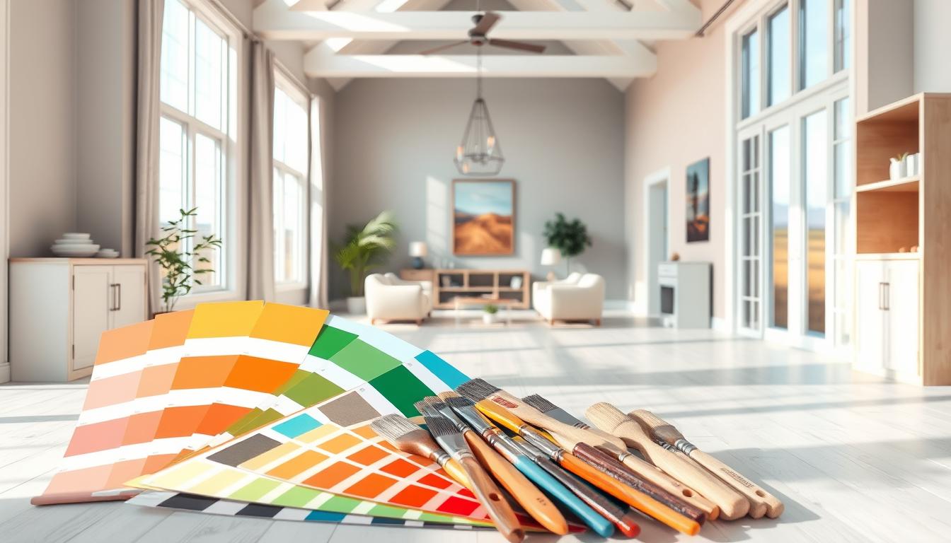
Did you know the right wall color can boost a property’s value and change a room’s feel? Finding the perfect interior design paint colors can seem hard. But our guide will help you get the look you want for your space.
We’ll show you the latest trends, expert advice, and what to think about when picking the best home interior paint colors for your interior design. Whether you want to update one room or your whole space, our guide will guide you.
Key Takeaways
- Understand the impact of color on your space’s ambiance
- Learn about the latest trends in interior design paint colors
- Discover expert tips for choosing the perfect paint colors
- Explore factors to consider when selecting paint colors
- Get insights into creating a cohesive look throughout your space
Understanding the Impact of Color in Home Interiors
Color has a huge impact on our homes. It changes how we feel and interact in our spaces. The colors we pick for walls, furniture, and decor can make a room feel different. They can affect our mood, energy, and how much we want to socialize.
The Psychology of Color
The study of color psychology is complex. It looks at how colors affect our emotions and actions. Colors can make us feel calm or excited. For example, blue is calming, while red is energizing.
Studies show that color can change how we feel. Being near natural light and certain colors can lift our mood and help with depression.
Color and Mood
Color and mood are personal and can differ for everyone. Yet, some colors are often linked to certain feelings. Green is about balance, while yellow makes us happy.
“Color is a power which directly influences the soul.” – Wassily Kandinsky
Color Trends Over the Years
Color trends in homes have changed a lot over time. These changes reflect cultural, social, and economic shifts. In the 1970s and 1980s, earthy tones and bold colors were in. The 1990s and early 2000s favored neutral tones and simple designs.
| Decade | Popular Colors | Influences |
|---|---|---|
| 1970s | Earth tones, Avocado green | Psychedelic movement, naturalism |
| 1980s | Pastel colors, Bold primaries | Pop culture, Memphis design |
| 2000s | Neutrals, Soft pastels | Minimalism, Scandinavian design |
Knowing about color psychology and trends helps us choose better paint colors. This knowledge lets us create spaces that look good and support our well-being.
Choosing the Right Color Scheme
The right color scheme can make your home look amazing. It creates a cozy and welcoming feel. When designing your home, picking the right colors is key. It greatly affects how your home looks and feels.
Monochromatic vs. Complementary Colors
There are two main ways to choose colors: monochromatic and complementary. A monochromatic color scheme uses different shades of one color. This makes your home look clean and classy. On the other hand, complementary colors are pairs that are opposite each other on the color wheel. They make a room look bold and lively.
For example, using different shades of blue for modern home paint colors can make a room calm. But, blue and orange together can make a room feel energetic.
How to Create a Cohesive Look
Creating a cohesive look is more than just picking colors. It’s about making your home flow well. Here are a few tips:
- Choose a main color and use its variations throughout your home.
- Use a common element, like texture or material, to connect different rooms.
- Follow the 60-30-10 rule: 60% of a main color, 30% of a secondary color, and 10% of an accent color.
By following these tips, you can make your home look great. It will show off your top-rated interior paint colors beautifully.
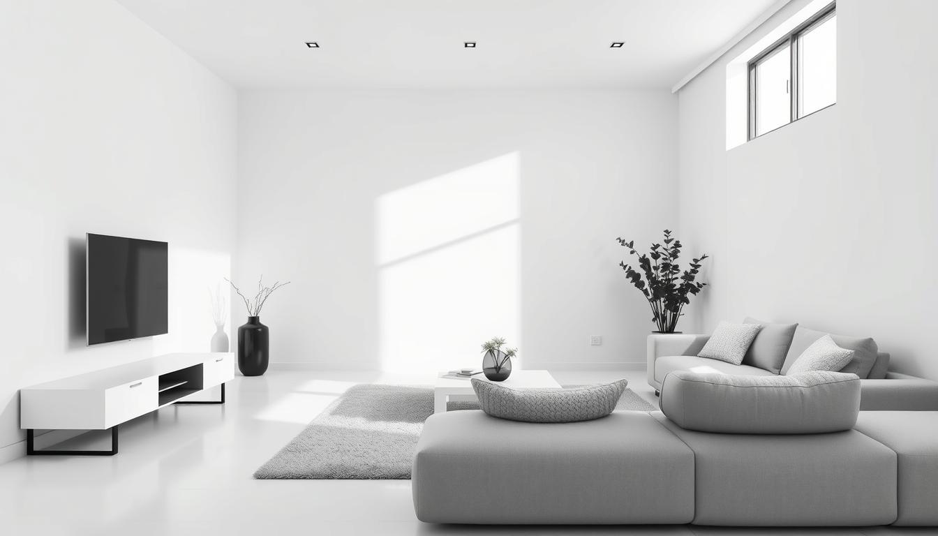
The Role of Neutrals in Design
Neutral colors are very important in design. They provide a base for your decor. Colors like beige, gray, and white can balance bold colors and make rooms feel calm. They also make rooms look bigger.
| Neutral Color | Effect on Room | Best Used With |
|---|---|---|
| Beige | Creates warmth and coziness | Earth tones, natural materials |
| Gray | Provides balance and sophistication | Bold colors, metallic accents |
| White | Makes rooms appear larger, clean | Any color, modern decor |
When picking home interior paint colors, using neutrals is a good idea. It makes your design better and makes it easy to add other colors with furniture and decor.
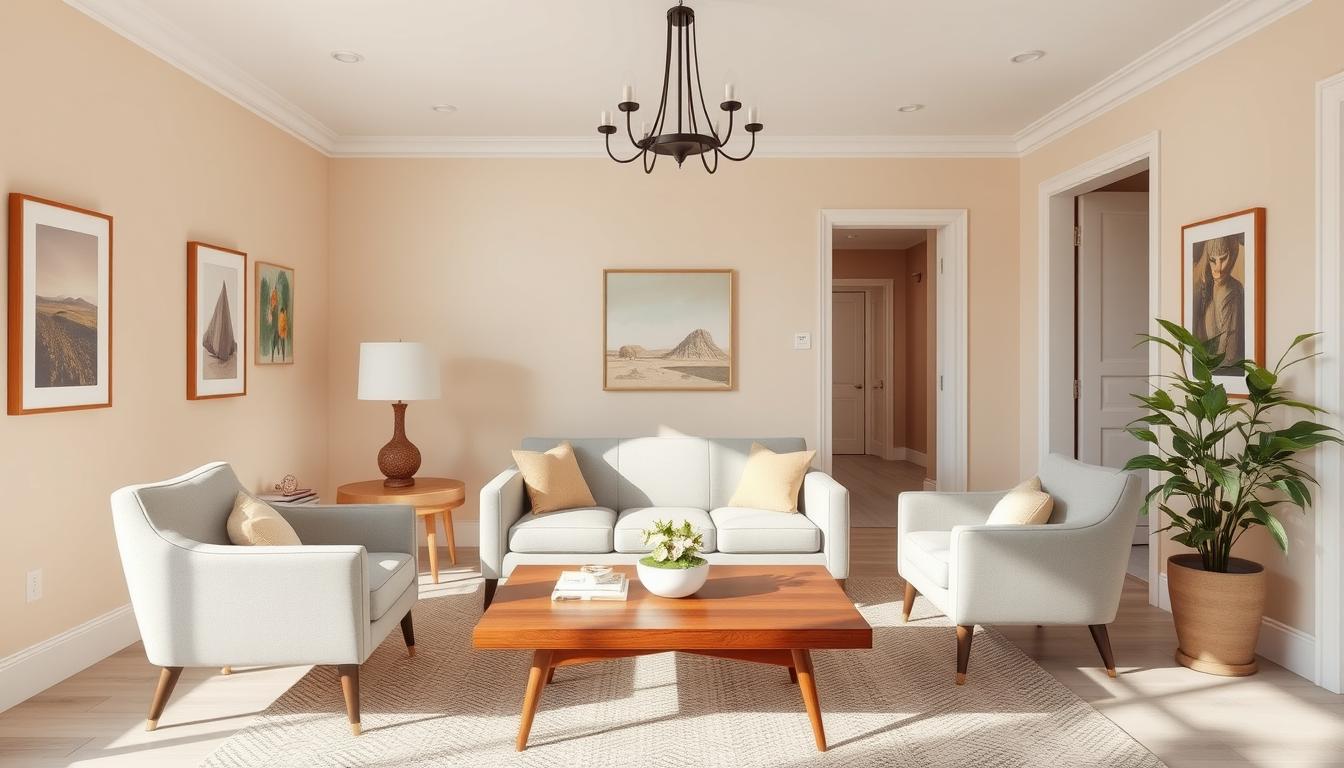
Popular Home Interior Paint Colors in 2023
In 2023, home interior paint colors are all about variety. They cater to different tastes and styles. This year, we see a mix of classic colors with a modern twist. Homeowners have many options to update their homes.
Trending Shades for Living Rooms
The living room is the heart of our homes. The right paint color can make it feel more welcoming. Here are some trendy home paint colors for living rooms in 2023:
- Soft blues and greens for a calming vibe
- Warm neutrals like beige and taupe for coziness
- Rich jewel tones like emerald green and navy blue for luxury
Best Colors for Bedrooms
Bedrooms are our retreats. The paint color greatly affects our relaxation and sleep. The best interior paint colors for bedrooms this year are:
- Soothing shades like light gray and pale blue for calmness
- Soft pastels for a sweet and calm feel
- Deep, muted colors like charcoal and plum for coziness
Kitchen and Dining Room Favorites
Kitchens and dining rooms are where we make memories. The popular interior paint colors for these spaces in 2023 aim to create warmth and welcome. Some top picks include:
- Crisp whites and creams for a clean, airy feel
- Warm reds and oranges to spark conversation and appetite
- Soft yellows and greens for freshness and energy
Choosing the right paint colors can improve both the look and function of your rooms. Whether you prefer trendy home paint colors or classic choices, 2023 has something for everyone.
Factors to Consider When Selecting Paint Colors
Choosing the right paint color for your home is more than picking a color you like. It’s about making a space that feels right for you and your life. It should show off your style and fit your needs.
Room Size and Natural Light
The size of a room and how much natural light it gets are key. Light colors can make small rooms look bigger. Dark colors can make big rooms feel cozy.
Experts say, “The size of a room can seem different based on the colors used.” For example, a room with little natural light looks better with lighter colors.
| Room Size | Recommended Color | Effect |
|---|---|---|
| Small | Light Colors (e.g., whites, creams) | Makes the room feel larger |
| Large | Dark Colors (e.g., navy blues, deep greens) | Creates a cozy atmosphere |
Existing Decor and Furniture
Your furniture and decor greatly affect the paint color you should choose. The wall color should match your furniture and decor for a unified look.
Think about your furniture and decor colors when picking a paint color. For example, bold furniture looks better with neutral walls.
“A well-chosen paint color can tie together disparate elements in a room, creating a sense of harmony.” – Design Expert
Personal Preferences and Lifestyle
Your personal taste and lifestyle should guide your paint color choice. Think about how you use the space and the mood you want to create.
- If you work from home, choose a color that helps you stay focused.
- If you have young kids, pick a color that’s easy to clean.
By thinking about these points, you can pick a paint color that looks good and makes your space better.
Enhancing Small Spaces with Color
Choosing the right colors is key for small spaces. It can make them feel bigger or cozier. We’ll look at how color can change a small room into a welcoming spot.
Light Colors to Make Rooms Feel Larger
Light colors on walls and ceilings make rooms look bigger. Soft whites, creamy beiges, and pale grays work well. These modern home paint colors help light bounce around, making the room feel airy.
For example, light gray or blue-gray can make a room feel calm and open. Using the same light color on walls and trim also helps the space feel connected.
Dark Colors for Cozy Vibes
Dark colors, like navy blues and emerald greens, make rooms cozy. They add warmth and depth to small areas. These top-rated interior paint colors are great for a snug feel.
But, mix dark colors with lighter shades to avoid feeling trapped. Using dark colors on one wall or in small amounts adds charm without overwhelming the space.
Accent Walls for Depth
Accent walls add depth and interest to small spaces. A bold, contrasting color on one wall creates a focal point. Trendy home paint colors like deep berry tones or rich turquoises work well for accent walls.
Think about the color scheme and mood you want when picking an accent wall color. It can also draw attention away from the room’s size, highlighting a special feature.
The Role of Finishes in Paint Selection
The finish of your paint greatly affects your walls’ look and how long they last. When picking the best paint colors for your home, think about the finish too. The right finish can make your paint colors look better and last longer.
Matte, Satin, and Glossy: What’s the Difference?
There are many paint finishes, each with its own traits. The most common are matte, satin, and glossy.
- Matte Finish: A matte finish looks flat and doesn’t reflect light. It hides wall imperfections well but might not last as long as others.
- Satin Finish: Satin has a soft sheen and is more durable than matte. It’s great for most rooms, like living areas and bedrooms, because it looks good and lasts.
- Glossy Finish: Glossy is very reflective and lasts a long time. It’s best for places with a lot of moisture, like kitchens and bathrooms, because it’s easy to clean.

Choosing the Right Finish for Each Room
Every room has its own needs for paint finish. For example, busy areas need durable finishes, while bedrooms focus on looks.
- For living rooms and bedrooms, satin is a good choice. It balances looks and durability well.
- In kitchens and bathrooms, go for glossy. It resists moisture and is easy to clean.
- For ceilings, matte is a smart pick. It reduces glare.
The Importance of Durability
Durability is key when picking paint. A durable finish can handle wear and tear, saving you from frequent touch-ups. When picking paint colors, think about how well the finish resists fading, stains, and moisture.
Understanding finishes helps you make better choices for your home’s interior. Whether painting one room or the whole house, the right finish is essential for great results with your paint colors.
Color Combinations to Avoid
The world of interior paint colors is vast, yet some combinations can clash. When picking interior color schemes, think about how colors work together.
Some color mixes can overwhelm or clash, ruining your home’s look. Knowing how to pick colors that work well is key to a peaceful home.
Clashing Colors and How to Prevent Them
Clashing colors happen when hues don’t mix well. This can be when colors are too close but not quite right, or too far apart. Use the color wheel to find colors that complement or go together.
For example, bold colors like reds and oranges are exciting. But pairing them with jarring greens or purples is not good. Use neutral colors as a base and bold colors as highlights.
Overused Combinations That May Underwhelm
Some color mixes are classic but can feel too common. For instance, “white walls with beige trim” is a popular interior paint colors choice. But it can feel dull if not done differently.
To make your color scheme stand out, add unexpected colors or textures. This can be through furniture, decor, or a bold accent wall.
By choosing colors wisely and avoiding clashes, you can make your home stylish and inviting. Try different interior color schemes to show your style and make your home feel like yours.
Using Color to Experiment with Style
Color is a key tool in interior design. It lets you try out different styles. The right colors can make your home welcoming and unique.
Transitional Styles and Color Choices
Transitional style blends old and new for a lasting look. For this, use neutral color palettes with slight contrasts. Beige, gray, and taupe are great for this style.
- Soft whites and creams for a clean look
- Warm neutrals to add coziness
- Muted earth tones for depth
Eclectic Designs That Work
Eclectic design celebrates individuality and creativity. To pull it off, balance bold colors and patterns. Start with a neutral base and add color through furniture and decor.
- Choose a dominant color and complementary accents
- Mix patterns and textures to add visual interest
- Use bold colors sparingly to avoid overwhelming the space
Adding a Pop of Color to Minimalist Spaces
Minimalist design focuses on simplicity and clean lines. A pop of color can enhance the look without losing the minimalist feel. Use vibrant hues through accessories or a statement piece.
- Use a brightly colored rug to anchor the room
- Add colorful throw pillows for a touch of personality
- Incorporate a statement piece of art or furniture
By carefully choosing colors, you can make your space reflect your personality and style. Whether you prefer transitional, eclectic, or minimalist, the right colors can transform your space.
DIY vs. Professional Painting: Color Considerations
Choosing to paint your home’s interior yourself or hiring a pro is a big decision. It affects the color and the quality of the finish. When picking the best interior paint colors, think about the pros and cons of each option.
When to Hire a Professional
Going for a pro is wise for complex color schemes or tricky surfaces. They have the skills for a smooth, even finish. This is key for trendy home paint colors.
- Complex color schemes need a pro to avoid mistakes.
- High ceilings or hard-to-reach areas need special equipment and safety.
- Surfaces needing special prep, like stained or damaged walls, are best left to a pro.
For example, a bold color for your living room? A pro can get the shade and finish right. Design experts say, “A fresh coat can change a room, but the right color and finish are key.” Knowing the cost is also important when choosing DIY or pro painting.
The Benefits of DIY Painting Projects
DIY painting can save money and give you a sense of accomplishment. With the right tips, you can get professional-looking results with top-rated interior paint colors.
| Aspect | DIY Painting | Professional Painting |
|---|---|---|
| Cost | Lower upfront costs | Higher initial cost, but results last longer |
| Expertise | Needs personal research and skill | Professionals have experience and know best practices |
| Time | Time-consuming for beginners | Done faster due to pro efficiency |
Benjamin Moore’s color experts say picking the right paint color is just the start. The finish and how you apply it are also key. Whether DIY or pro, understanding your color choices is crucial.

In conclusion, whether to DIY or hire a pro depends on your comfort with color and application. By considering these factors and weighing the pros and cons, you can make a smart choice for your home’s interior.
Maintenance and Longevity of Paint Colors
Keeping your interior paint colors looking great depends on care and maintenance. It’s key to know how to keep your paint colors looking good over time.
How to Keep Colors Fresh Over Time
To keep your home interior paint colors bright, regular cleaning is a must. Dust and dirt can make your walls look dull. Clean your walls with a soft cloth and mild soap. Stay away from harsh chemicals or abrasive materials that can harm the paint.
Also, controlling sunlight in your home helps. Too much sunlight can fade colors. Use UV-filtering window treatments to reduce this effect.
Touch-Up Tips for Busy Homes
In busy homes, touch-ups are key to keeping your interior color schemes looking good. Save a small amount of paint from the original job for touch-ups. This ensures repairs blend in seamlessly.
For small scuffs, use a small brush to touch them up. For bigger damage, you might need to repaint the whole wall. For popular interior paint colors, finding matching paint is usually easy.
| Maintenance Task | Frequency | Benefit |
|---|---|---|
| Cleaning Walls | Every 3-6 months | Keeps colors vibrant |
| Touching Up Scuffs | As needed | Maintains uniform appearance |
| Using UV-Filtering Window Treatments | Daily | Prevents color fading |
By following these tips, your popular interior paint colors will last for years. Regular care not only keeps your home looking fresh but also makes your paint job last longer.
Environmental Considerations in Paint Selection
As we become more aware of our impact on the planet, choosing the right paint is key. The paint industry has stepped up with eco-friendly options. These paints not only help the environment but also improve the air inside our homes.
Eco-Friendly Paint Options
Eco-friendly paints use natural ingredients and have fewer harmful chemicals. They are better for both our health and the planet. Brands like Benjamin Moore’s Natura and Sherwin-Williams’ ProMar 200 are popular choices.
- Low-VOC Paints: These paints release fewer harmful chemicals into the air.
- Natural Paints: Made from natural stuff like clay and plant dyes, they break down easily.
- Recycled Paints: Some paints are made from recycled materials, cutting down on waste.
The EPA says low-VOC paints can make our air cleaner. “Choosing low-VOC paints helps reduce harmful chemicals and makes our homes healthier.”
“Using eco-friendly paints is a step towards living sustainably. It’s not just about the color; it’s about keeping our planet and families healthy.”
Understanding VOCs and Indoor Air Quality
VOCs are chemicals that evaporate easily and can harm our health. Paints with lots of VOCs can pollute our indoor air, making asthma worse.
| VOC Level | Description | Health Impact |
|---|---|---|
| High VOC | Emits strong fumes | Can cause headaches, dizziness |
| Low VOC | Emits fewer fumes | Less likely to cause health issues |
| Zero VOC | No VOC emissions | Safer for indoor use |
Think about it: we spend about 90% of our time indoors. So, picking paints with low or zero VOCs is important for clean air.
By choosing eco-friendly paints and knowing about VOCs, we can make choices that are good for us and the planet.
Final Thoughts on Choosing Interior Paint Colors
Choosing the right home interior paint colors is key in home design. It shows your personal style and makes your living space better. With so many options, picking trendy colors that fit your style can be tough.
Personal Style and Color
Your home’s colors show who you are and what you like. By picking colors that speak to you, your home will feel like your own. Whether you love bright colors or soft ones, the right choice can make your home feel welcoming.
Lasting Impact of Color Choices
The colors you choose will change your home’s look forever. Think about room size, light, and decor when picking. Trendy colors are a good start, but remember your own taste and lifestyle too.