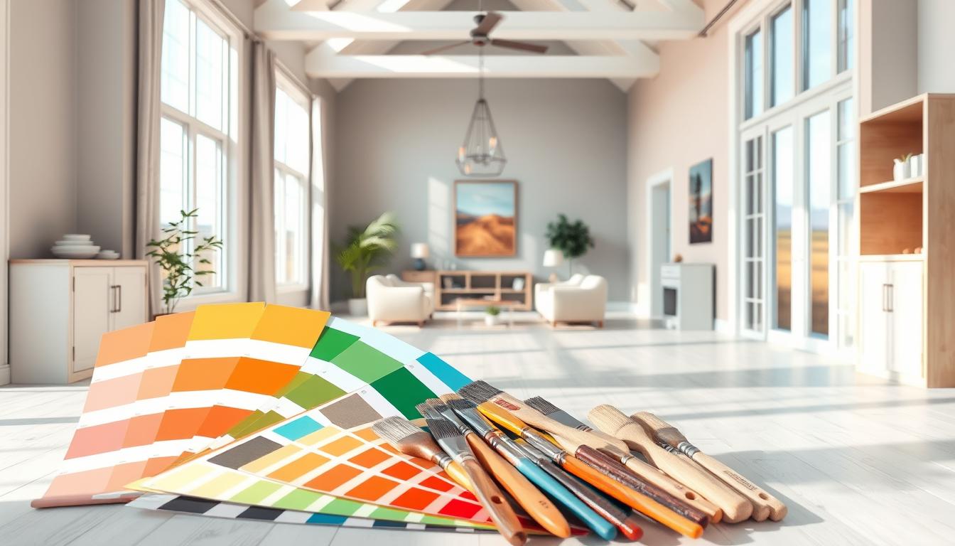
Did you know that the colors in your home decor can really affect your mood? Choosing the right colors can be tough with so many options. In our guide, we cover the top interior color schemes that are popular now and classic colors that always work.
We’ll share expert tips on picking the perfect colors for your home. Whether it’s a single room or your whole house, we’ve got you covered. Our guide aims to inspire and educate you in choosing the right colors.
Key Takeaways
- Discover the latest trends in home interior colors.
- Learn how to choose the best color scheme for your living space.
- Explore expert tips on creating a harmonious and inviting atmosphere.
- Understand the psychological impact of different colors on your mood.
- Get inspiration for your next home decor project.
Introduction to Home Interior Colors
Choosing the right colors for your home is key to good design. It affects how your home looks and feels. The colors we pick can change the mood of our homes.
Exploring home interior colors shows us how colors shape our spaces. Colors are more than just what we like. They deeply affect how we see and use our homes.
Importance of Color in Interior Design
Colors are a basic part of design, changing a room’s feel. The right colors can make a room feel bigger, cozier, or more lively. It all depends on what we want.
When picking colors, think about how they make us feel. Light colors open up a space, while dark colors warm it up.
| Color | Emotional Impact | Design Use |
|---|---|---|
| Blue | Calming, Trusting | Bedrooms, Offices |
| Red | Energizing, Passionate | Living Rooms, Dining Areas |
| Green | Balancing, Refreshing | Home Offices, Living Rooms |
How Colors Affect Mood and Perception
Colors can change how we feel and see a space. Knowing this helps us pick the right colors for our homes.
Cool colors like blues and greens calm us down. They’re great for bedrooms and places to relax. Warm colors like oranges and reds energize us. They’re perfect for social areas like living rooms.
By thinking about color’s effects, we can make our homes beautiful and supportive of our well-being.
Trending Home Interior Colors in 2023
In 2023, home interior design is buzzing with new color trends. These colors are changing how we see our living spaces. They reflect the latest design styles and shape the feel of our homes.
Overview of Current Color Trends
Home interior colors now mix bold, eye-catching hues with calm, neutral shades. The top interior paint choices lean towards colors that bring peace and comfort. They also add a bit of drama and personality to any room.
Among the favorite room color trends, blues are big. From light sky blues to deep navy, they create calm and stylish spaces. Earthy tones like terracotta and clay are also popular for their warm, natural look.
Why People Are Choosing These Colors
So, why do people pick these colors? It’s because colors deeply affect our mood and how we feel at home. The leading home color palettes of 2023 aim to make spaces that feel welcoming and true to who we are.
Also, today’s trends reflect a love for nature and sustainability. Earthy and natural colors are not just pretty. They also match our growing desire for eco-friendly homes and design.
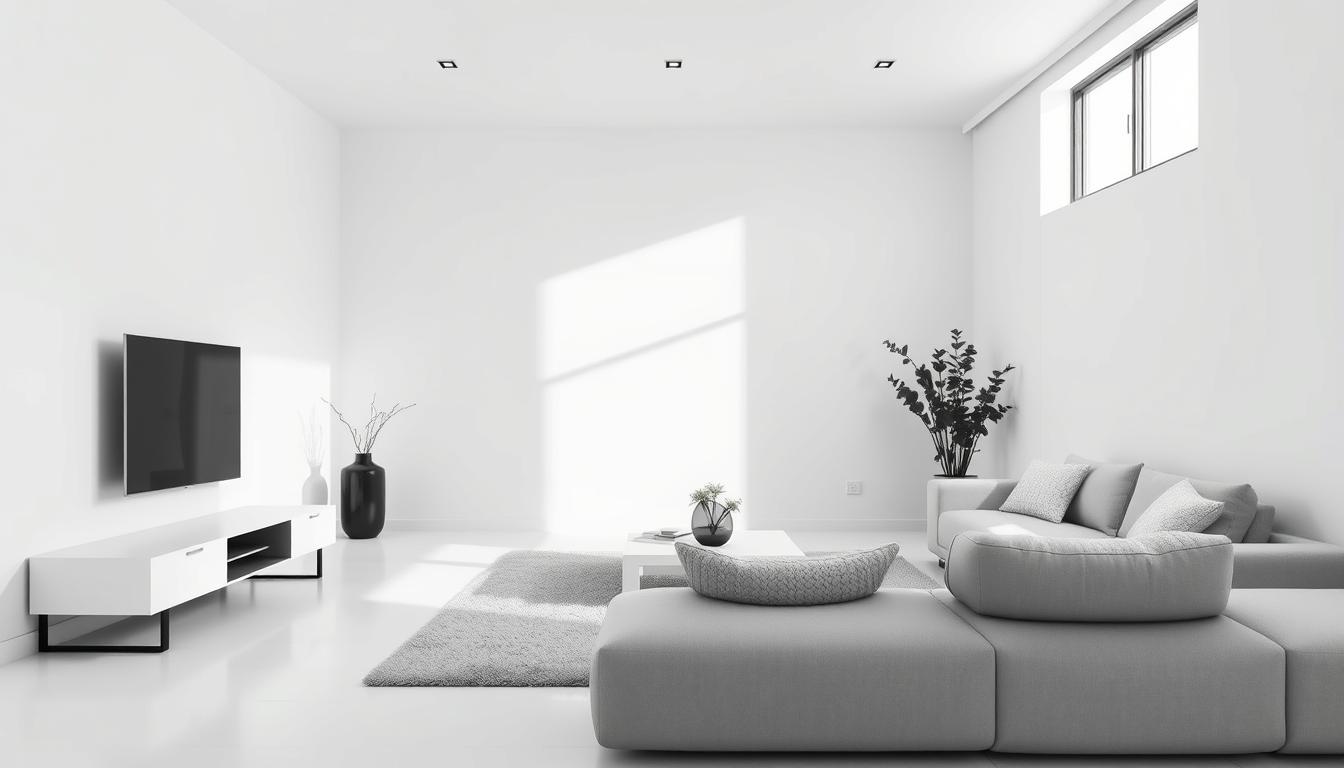
Neutral Tones: Timeless Elegance
Neutral tones in home decor are timeless and elegant. They create a clean, serene atmosphere. These colors have been a key part of home design for years, fitting well with many styles.
Shades of Gray
Gray is a versatile color that works well in many ways. Light gray makes rooms feel bigger and airier. Dark gray adds coziness and depth. It’s great for highlighting colorful furniture and decor.
Warm Beige and Taupe
Beige and taupe are warm, earthy colors that add comfort. They’re perfect for cozy living rooms and bedrooms. These colors also complement natural materials like wood and stone.
- Beige can reflect light and brighten a room.
- Taupe adds sophistication and depth to decor.
The Power of White
White makes rooms feel clean, fresh, and spacious. It’s great for small rooms or those with little natural light. White also showcases colorful artwork and decor well.
| Neutral Tone | Effect on Room | Best Used With |
|---|---|---|
| Gray | Can make a room feel larger or cozier depending on the shade | Colorful furniture and decor |
| Beige/Taupe | Adds warmth and coziness | Natural materials like wood and stone |
| White | Makes a room feel clean and spacious | Colorful artwork and decorative pieces |
Bold Statement Colors
Bold statement colors can make a room stand out. These vibrant hues can change a space, leaving a lasting impression.

Bold colors aren’t just for accent walls. They can make any room dramatic. Using colors like deep blues, rich greens, or vibrant reds can add a unique touch.
Deep Blues and Navy
Deep blues and navy are popular wall paint shades. They add sophistication and elegance. These cool tones are calming, great for bedrooms or home offices.
To balance deep blues, pair them with neutrals like beige or white. This contrast makes the space visually appealing and harmonious.
Rich Greens and Forest Tones
Rich greens and forest tones are in-demand interior design colors. They bring nature indoors. These earthy shades create a cozy atmosphere, perfect for living rooms or family rooms.
To avoid overwhelming, balance rich greens with lighter shades or natural textures. Wood or wicker works well.
Vibrant Reds and Oranges
Vibrant reds and oranges add energy and warmth. They’re great for kitchens or dining areas, creating a lively atmosphere.
When using vibrant reds and oranges, balance them with neutrals. Using them as accent walls or in decorative accessories is effective.
By using bold statement colors wisely, you can create a unique space. Whether it’s deep blues, rich greens, or vibrant reds, balance is key. This ensures a harmonious and inviting atmosphere.
Pastel Colors: Soft and Serene
Pastel colors are great for a calm home. They contrast well with bold colors. These soft hues are perfect for bedrooms and nurseries, where you want to relax.
Light Blues and Mint Greens
Light blues and mint greens are very soothing. They remind us of clear skies and fresh leaves. These colors work well in bathrooms and bedrooms to create peace.
Pair light blues and mint greens with neutral colors like white or beige. This makes them even softer. Adding gentle patterns can also add interest without being too much.
Soft Pink and Lavender
Soft pink and lavender add warmth and elegance. Soft pink is playful and feminine. Lavender brings luxury and calm. These colors work in many rooms, from nurseries to living areas.
Use soft pink and lavender as accent colors. Add them to your decor with throw pillows, blankets, or vases. This way, you can enjoy their beauty without taking over the space.
The Benefits of Using Pastels
Pastel colors help your home feel connected. Using different pastel shades in rooms creates a cohesive look. This ties your decor together nicely.
Pastel colors also fit many decorating styles. They work from modern to traditional. Whether you want a bold statement or a subtle look, pastels are flexible and can be tailored to your taste.
When we talk about top interior color schemes and best home decor colors, pastels are a favorite. They are soft and serene, making them perfect for a peaceful home.
Earthy Hues: Connection to Nature
Earthy hues bring the outdoors into our homes, creating harmony and balance. They are a key part of interior design, making homes feel natural and cozy. Homeowners love them for their warm and inviting feel.
Earthy tones include a variety of colors, each with its own charm. Let’s look at some popular ones and how to use them in your home.
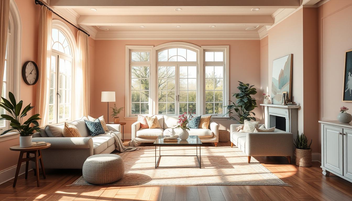
Terracotta and Clay Colors
Terracotta and clay colors are warm and inviting. They remind us of rustic landscapes. These colors add coziness to any room, making them great for:
- Accent walls
- Decorative pottery
- Textiles such as throw blankets and rugs
Using terracotta and clay colors makes your home feel warm and welcoming.
Olive Greens
Olive greens are a popular earthy tone. They are versatile and can be used in many ways, like:
- Accent pieces like vases and decorative boxes
- Wall paint for a unique and natural look
- Furniture upholstery for a bold statement
Olive greens add calm and serenity to a room. They’re perfect for spaces where you want to relax.
Warm Brown Tones
Warm brown tones are timeless and versatile. They fit well with many interior styles. They can make any room cozy, like living rooms, bedrooms, and kitchens. You can use them in:
- Wooden furniture
- Leather upholstery
- Earth-toned ceramics
Adding these earthy hues to your decor creates a harmonious and inviting space. It shows off your personal style.
As we explore home interior colors, earthy tones stand out. They are most popular home interior colors and trending home paint colors. They offer a natural and organic feel that’s soothing and pleasing to the eye.
The Psychology of Color Choice
The colors we pick for our homes do more than look good; they affect our feelings and actions. Knowing the psychology of color choice helps us pick colors that make our homes better.
Understanding Color Psychology
Color psychology explores how colors influence our emotions and actions. It’s shaped by our personal experiences, culture, and what we like. For example, some find blue calming, while others see it as sad.
When picking in-demand interior design colors, knowing these effects helps us choose popular wall paint shades. These colors not only look good but also improve our well-being.
“Colors are the mother tongue of the subconscious.” – Carl Jung
Common Associations with Popular Colors
Different colors mean different things to us. Neutral colors like beige and gray are calming and peaceful. They’re top interior paint choices for bedrooms and living rooms.
| Color | Common Associations |
|---|---|
| Blue | Calmness, Trust |
| Red | Energy, Passion |
| Green | Nature, Harmony |
By knowing these associations, we can choose colors wisely. This way, we create spaces that are both beautiful and good for our minds.
For instance, soft greens or blues can make a room calm. On the other hand, bold colors like red or orange can boost energy and activity.
Choosing the Right Color for Each Room
The colors in your home greatly affect the feel and use of each room. Different rooms have different roles, and the right colors can highlight their special qualities. We’ll look at some top color picks for various rooms in your home.
Living Room Color Ideas
The living room is the heart of the home, where everyone comes together. Choose warm and inviting colors to make it a place for relaxation and talking. Beige, taupe, and soft grays can make it calm. Navy blue or emerald green can add elegance.

To add a pop of color, use accent colors in furniture and decor. For more ideas, check out our guide on crafting a stunning color palette.
Bedroom Color Recommendations
The bedroom is a place to rest and relax. Soft colors like light blues, pale greens, and gentle lavenders can make it peaceful. For a cozy feel, try warm neutrals like terracotta or soft peach.
| Color | Mood | Best for |
|---|---|---|
| Light Blue | Calmness | Bedrooms |
| Soft Gray | Serenity | Living Rooms |
| Terracotta | Warmth | Cozy Spaces |
Colors for Home Offices
A home office needs colors that help you stay focused and productive. Cool, calming colors like blues and greens can reduce stress and boost concentration. Brighter shades like yellow or orange can energize the space.
When picking colors for your home office, think about your work and the look you want. The right colors can make your office both useful and inspiring.
Combining Colors: Strategies for Cohesion
Creating a cohesive color scheme is key for a harmonious home. A well-planned color palette can connect different rooms and design elements. This creates a sense of continuity and flow.
Create a Color Palette
To start, pick a core color that shows your style and fits your home’s architecture. Then, choose secondary colors that go well with your core color. Use the 60-30-10 rule for guidance: 60% of the room is the dominant color, 30% is secondary, and 10% is an accent.
Neutral tones like beige and gray are popular for palettes. They offer a versatile background for other design elements.
| Color Scheme | Description | Example |
|---|---|---|
| Monochromatic | Different shades of the same color | Various shades of blue |
| Complementary | Colors opposite each other on the color wheel | Blue and orange |
| Analogous | Colors next to each other on the color wheel | Blue, green, and yellow |
Tips for Mixing and Matching Shades
When mixing shades, think about the color wheel and how colors interact. Monochromatic schemes offer a cohesive look. Complementary colors add contrast and interest.
Also, consider trending home paint colors for your palette. They can enhance your cohesive look.
Conclusion: Making Your Choice
Choosing the right colors for your home is a personal journey. It involves looking at popular interior design colors and wall paint shades. This way, you can make a space that shows off your style.
Color Selection Tips
Think about your lifestyle and what you like when picking colors. This helps you find a color scheme that’s not just pretty but also feels like home.
Personalizing Your Space
It’s important to make your space your own. Whether you love bold colors or soft pastels, choose what speaks to you. Using popular wall paints and trendy interior colors makes your space both stylish and meaningful.