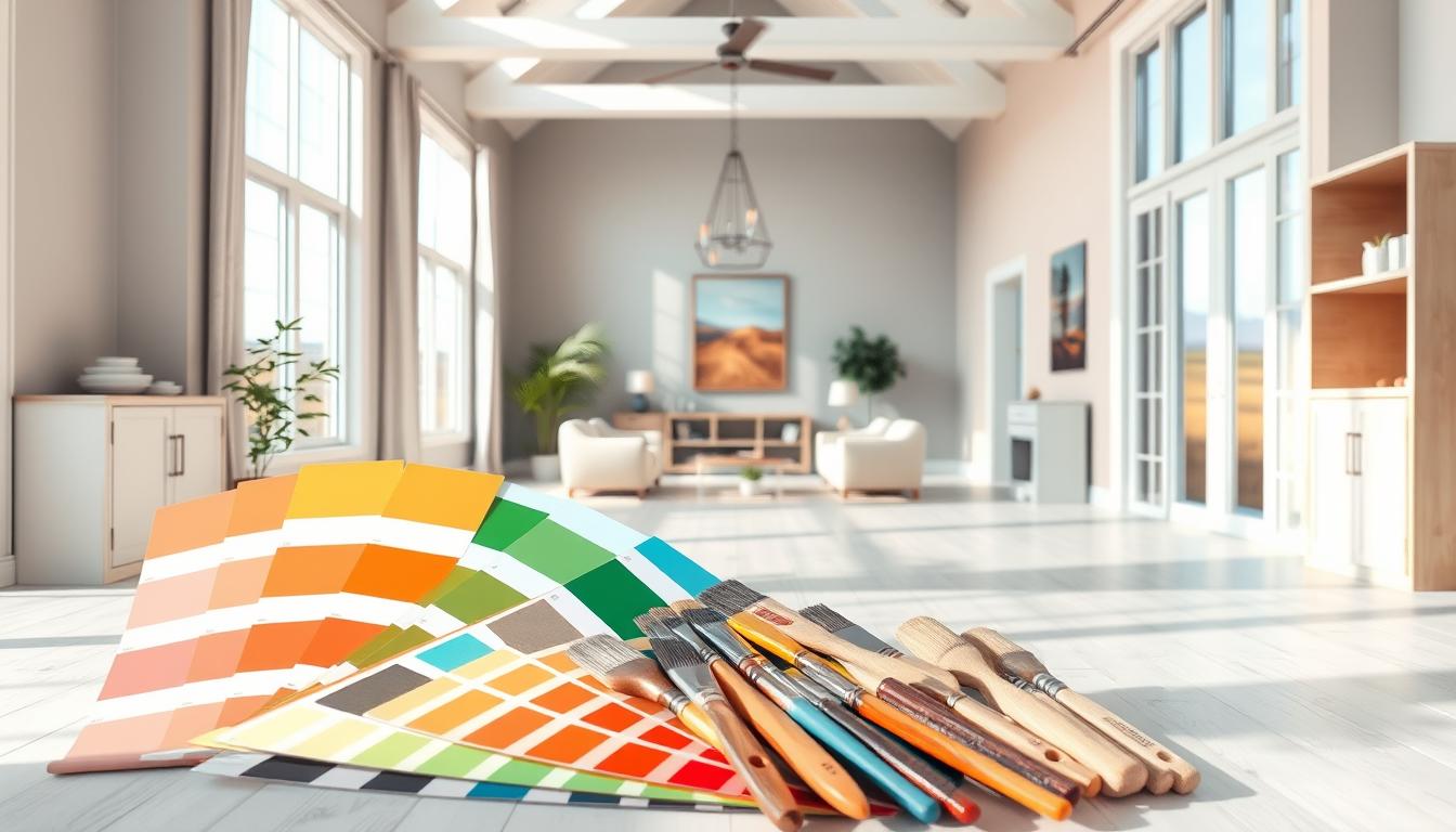
Did you know the right interior paint colors can change your living space’s feel? A fresh paint job is a simple yet powerful way to update a room.
We’re excited to share our top home color schemes to help you get a beautiful, cohesive look. Whether you’re searching for popular wall colors or creative ideas, we’ve got you covered.
Key Takeaways
- Discover the latest trends in interior paint colors
- Learn how to choose the perfect color scheme for your space
- Get expert tips on achieving a cohesive look
- Explore popular wall colors that can elevate your decor
- Find inspiration for your next interior design project
Choosing the Right Color Palette for Your Home
The right color palette can change your home’s feel. It’s key to know what affects this choice. When picking interior color inspiration, many things help make a space feel right.
Understanding Color Psychology
Colors deeply affect our feelings and mood. Color psychology explores how colors influence us. Warm colors like red and orange boost energy. Cool colors like blue and green help us relax.
Knowing how colors make us feel is vital. It helps pick the right colors for each room in your home.
The Importance of Lighting
Lighting is a big deal when picking colors. Natural and artificial light change how colors look. A color might look great in bright light but not in dim light.
So, test your colors under different lights. This ensures they look good all day.
Tips for Harmonizing Colors
Creating a color scheme that works takes more than just liking a color. Here are some tips:
- Use a color wheel to find colors that go well together.
- Keep to three to four main colors to avoid too much.
- Follow the 60-30-10 rule: 60% main color, 30% secondary, and 10% accent.
- Try your colors with different textures and patterns to keep it cohesive.
By understanding color psychology, thinking about lighting, and using these tips, you can pick a trendy home color scheme. It will look amazing and make your home feel better.
Popular Interior Color Trends in 2023
As we enter 2023, interior design is buzzing with new color trends. These colors promise to change our living spaces. They reflect our personalities and improve our homes.
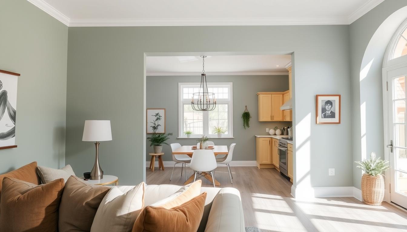
Earthy Tones and Neutrals
In 2023, earthy tones and neutrals are back in style. These colors, inspired by nature, add warmth and coziness. Terracotta, sienna, and moss are popular for creating welcoming spaces.
For more on natural elements in home decor, see our article on top home interior design trends for 2023.
Bold Accent Colors
If you want to stand out, bold accent colors are the way to go. Colors like cobalt blue, emerald green, and mustard yellow make rooms pop. Use them on walls, furniture, or accessories to boost your home’s look.
Pastel Shades for Calmness
Pastel shades are also trending for their calming effect. Soft pinks, baby blues, and mint greens create peaceful areas. They’re ideal for bedrooms, nurseries, or any room where you want to relax.
In summary, 2023’s color trends have something for everyone. From earthy tones to bold colors and pastels, you can make your home stylish and personal.
Warm Colors: Inviting and Cozy
Warm colors can turn your home into a cozy haven. They make your space feel welcoming and inviting. These colors also affect our mood and the room’s ambiance.
Choosing the Best Shades
When picking warm colors, think about your home’s lighting and decor. Terracotta, golden yellow, and soft oranges are great for a cozy feel. Use them on walls, ceilings, or as accents to add warmth.
To get a balanced look, mix warm colors with neutral tones. For example, a terracotta wall with neutral furniture creates a nice contrast.
How Warm Colors Impact Mood
Warm colors make us feel comfortable and energized. They spark conversations and bring people together, perfect for living and dining areas. The right warm colors can make your space feel welcoming and positive.
Studies show warm colors can make a room feel warmer than it is. This is great for cold months, saving on heating costs and making your home cozy.
Which Rooms Benefit from Warm Colors
Warm colors are great in any room but best in cozy spaces. Living rooms, dining rooms, and family rooms are ideal. They encourage relaxation and togetherness.
| Room Type | Recommended Warm Colors | Effect on Mood |
|---|---|---|
| Living Room | Terracotta, Soft Orange | Promotes relaxation and coziness |
| Dining Room | Golden Yellow, Warm Beige | Stimulates conversation and appetite |
| Family Room | Soft Red, Warm Brown | Creates a sense of warmth and togetherness |
By using warm colors in your home, you can make it welcoming and cozy. This improves your mood and living experience.
Cool Colors: Creating a Relaxed Atmosphere
Cool colors can turn your home into a peaceful oasis. They calm your mind and body, making them great for relaxing spaces.
Best Cool Colors for Different Spaces
Various cool colors suit different rooms for the right vibe. Soft blues and pale greens are perfect for bedrooms, helping you relax. Calming purples can add luxury to your living room.
Think about the room’s natural light and purpose when picking cool colors. Lighter shades make rooms feel bigger and airier. Deeper shades create a cozy feel.
| Room | Recommended Cool Colors | Effect |
|---|---|---|
| Bedroom | Soft Blues, Pale Greens | Promotes relaxation and tranquility |
| Living Room | Calming Purples, Gentle Blues | Adds a touch of luxury and calmness |
| Bathroom | Cool Whites, Light Greens | Creates a refreshing and clean ambiance |
Enhancing Relaxation with Blues and Greens
Blues and greens are top picks for relaxation. Blues calm you, with light shades feeling serene and dark shades cozy.
Greens bring balance and harmony. From mint to forest, greens create a calming, natural vibe that boosts well-being.

Using cool colors like blues and greens in your design makes your space relaxing. They soothe your mind and body. Whether you’re redoing your whole home or just one room, cool colors are a smart choice.
Accent Walls: Adding Depth and Interest
Creating an accent wall is a great way to add personality to your living spaces. By picking a standout wall, you can bring depth and interest to any room.
Choosing the Perfect Wall to Accent
Choosing the right wall for accenting is key. Think about the room’s layout and the wall’s visibility. A wall with a fireplace, a large window, or one seen when you enter is perfect.
- Consider the natural lighting and how it affects the color.
- Think about the room’s purpose and how the accent wall will influence the ambiance.
- Choose a wall that naturally draws the eye.
Color Combinations for Accent Walls
The right color combination can make your accent wall stand out. For a bold look, try contrasting colors that complement each other. For a subtle effect, pick a shade that’s one tone deeper or lighter than the walls.
Popular color combinations include:
- Neutral tones with a bold accent: Pairing beige or gray with a vibrant color creates a striking contrast.
- Monochromatic shades: Different shades of the same color add depth without being too bold.
- Earth tones: Combining earthy colors like sienna, umber, and ochre creates a warm, inviting atmosphere.
When using trendy home color schemes, remember that popular wall colors change with the seasons. Keeping up with the latest trends helps you pick a color that feels fresh and current.
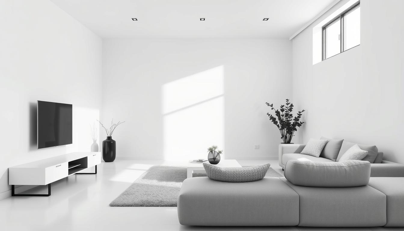
Minimalist Approaches to Home Color Schemes
Minimalist color schemes bring a clean and timeless look to homes. They focus on simplicity and a few colors. This creates a calm and serene atmosphere.
Whites and off-whites are key in minimalist color schemes. They make rooms feel bright and airy. This makes spaces look larger and more open.
Whites and Off-Whites
Whites and off-whites are great for a minimalist look. They range from pure white to soft creams. These colors add warmth and coziness without being too much.
Benefits of Whites and Off-Whites:
- Create a sense of brightness and airiness
- Add warmth and coziness to a room
- Provide a clean and neutral background for decor
Textured Finishes for Dimension
Adding textured finishes to a minimalist color scheme brings depth and interest. Finishes can range from smooth to rugged. The right finish can really make a space stand out.
Consider the following textured finishes to add dimension:
- Matte or satin paint finishes for a subtle look
- Textured wall coverings for added depth
- Natural materials like wood or stone for a organic feel
By mixing minimalist colors with textured finishes, you can create a unique and welcoming space. It shows off your personal style.

Optimal Color Combinations for Small Spaces
In small spaces, picking the right colors is key to making them feel welcoming. The right colors can make a room seem bigger, cozier, or both. It all depends on what you want.
When picking home painting color ideas interior, think about how colors work together and with the light. Light colors can make a room feel bigger. Darker colors can make it feel cozy.
Light Colors to Open Up Areas
Light colors make small spaces look bigger. They reflect light, making the space feel open and airy. Some good light color combos include:
- Soft whites and creams
- Pale pastels with neutral tones
- Monochromatic light shades
These combos not only make spaces look bigger but also fresh and clean. For example, soft white walls with cream-colored trim can make a room feel seamless and expansive.
Darker Shades for a Cozy Feel
While light colors open up spaces, dark colors create a cozy feel. Dark colors are great in small spaces for warmth and comfort. Some good dark color combos are:
| Color Combination | Effect |
|---|---|
| Deep blues with warm wood tones | Creates a cozy, cabin-like atmosphere |
| Rich greens with earthy browns | Brings a sense of nature indoors |
| Charcoal grays with soft whites | Offers a modern, sophisticated look |
These combos add depth and character to small spaces, making them feel more welcoming. For instance, deep blues on walls with warm wood tones for furniture can make a cozy nook.
Choosing the right colors can make your small spaces feel bigger or cozier, depending on what you like. Whether you’re following the top home painting trends or aiming for a timeless look, balance is key. It’s all about matching colors with the space’s overall feel.
Incorporating Trends with Timeless Choices
Creating a beautiful home interior means finding the right mix of trendy and classic colors. Refreshing your living space involves blending today’s color trends with timeless picks. This way, your home’s look will last for years.
Balancing Trendy and Classic Colors
Begin by identifying your home’s style core elements you wish to keep. Then, add trendy colors through accent pieces or a bold statement wall. For example, if you love this year’s earthy tones, pair a trendy terracotta with timeless neutrals like beige or cream.
Here are some tips for mixing trendy and classic colors:
- Use trendy colors for accent walls or decorative items
- Choose classic colors for big areas like ceilings and main walls
- Combine trendy and classic colors in furniture or bedding
Color Schemes That Stand the Test of Time
Some color schemes are timeless, no matter the trend. These include:
- Monochromatic neutrals for a clean, sophisticated look
- Soft pastels with crisp whites for a calming feel
- Rich jewel tones with neutral backgrounds for depth and luxury
When picking trendy colors, choose ones that reflect your style and the look you want. The best interior paint colors are those that match your personal taste and the overall look you aim for.
Mixing trendy and classic elements thoughtfully creates a stylish, lasting home interior. This way, you can enjoy today’s design trends while keeping your home beautiful for years.
DIY Painting Tips for Color Applications
Starting a painting project can seem scary, but with the right help, you can get amazing results. Whether you want to update one room or your whole house, our tips will guide you. You’ll learn how to paint efficiently and well.
Preparing Your Space for Painting
Before painting, you must prepare your space. This means clearing the room of furniture and covering the floor and any remaining furniture with drop cloths. Also, take out outlet covers and switch plates to avoid paint getting behind them. Clean the walls to remove dirt, grime, or grease that could affect paint adhesion.
Fix any holes or cracks in the walls with spackling compound and sand them smooth. This step ensures a smooth, even finish. For more details on preparing your walls, check out our article on finding the perfect interior paint for your.
Choosing the Right Tools and Techniques
The right tools are key to a great paint job. Invest in high-quality brushes and rollers that fit your project. Use microfiber rollers for smooth surfaces and wool rollers for textured ones.
For techniques, start with a primer if you’re using a dark color or covering a light one. Use even, smooth strokes to apply paint, working in sections for even coverage. Let the first coat dry completely before adding a second coat if needed.
By following these DIY painting tips, you’ll be on your way to a beautiful, professional-looking finish. Remember, the secret to success is preparation and paying attention to detail.
Final Thoughts on Choosing Your Home’s Colors
Choosing the right colors for your home is key. It can change how your home feels and looks. Think about what you like and what your home is like. This way, you can pick colors that are both beautiful and show who you are.
Revisiting Favorite Color Ideas
We’ve looked at many color ideas for your home’s interior. We’ve talked about warm and cool colors, and how to use them well. We’ve also covered how to pick colors for small spaces and how to use accent walls. These ideas can help make your home look good and feel right.
Personal Style in Color Choices
Your home’s colors should show your style. Do you like bright colors or soft ones? Your home’s colors should match your taste. This way, your home will feel like your own special place.