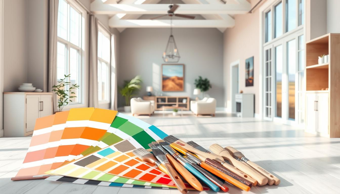
Did you know the right interior design color palettes can change your living space? It can make it feel more harmonious and look better. A unified color scheme is essential for a well-designed and intentional home atmosphere. In this guide, we’ll show you how to pick the perfect home interior color schemes to improve your living area.
We’ll cover color theory basics, popular color schemes, and tips for choosing paint colors for home. By the end, you’ll know how to create a beautiful and harmonious color palette that shows off your style.
Key Takeaways
- Understand the basics of color theory to make informed decisions.
- Explore popular interior design color palettes for inspiration.
- Learn practical tips for choosing the right paint colors for your home.
- Create a harmonious color scheme that reflects your personal style.
- Discover how to apply color theory principles to your interior design.
Understanding Color Theory in Interior Design
To make a space beautiful and useful, knowing color theory is key. Color theory helps mix colors in a way that looks good and works well together. It shows how colors interact and create harmony.
The Basics of Color Wheel
The color wheel is a circle with primary colors (red, yellow, and blue) at the center. It’s a basic tool for seeing how colors connect. It helps find primary and secondary colors, and how to pick colors that go well together.
How Colors Affect Mood
Colors deeply affect our mood and feelings. Different colors can make us feel calm, energetic, or warm. For example, blue makes us feel peaceful, while red makes us feel lively and passionate.
Knowing how colors make us feel is very important in design. It lets designers make spaces that feel right. By picking colors that match the room’s purpose, designers can make our experience better.
The Importance of Contrast
Contrast is key to making a room interesting and balanced. It’s about how different things, like colors and textures, stand out. High contrast makes a big statement, while low contrast is softer and more calm.
| Color Combination | Effect on Mood | Contrast Level |
|---|---|---|
| Blue and Green | Calming | Low |
| Red and Yellow | Energizing | High |
| Purple and Orange | Vibrant | High |
Popular Color Schemes for Home Interiors
The right color scheme can change your home’s feel, making it more welcoming and personal. Choosing a color scheme is key when designing your home. It greatly affects the look and feel of your space.
We’ll look at three top color schemes: monochromatic, analogous, and complementary colors. Each has its own benefits and challenges.
Monochromatic Schemes
Monochromatic schemes use different shades of one color for a unified look. This makes a space feel more harmonious and elegant.
For example, a monochromatic blue scheme can go from light sky blue to deep navy. This creates a calming atmosphere. Adding different textures and finishes can add depth to this scheme.
Analogous Color Combinations
Analogous schemes use colors next to each other on the color wheel. This creates a smooth, pleasing look.
For instance, blue, green, and yellow-green make a natural and refreshing palette. It’s key to balance warm and cool tones to avoid overwhelming the space.
Complementary Colors
Complementary colors are pairs of colors opposite each other on the color wheel. This scheme adds a bold, vibrant touch to a room.
Pairing blue with orange creates a striking contrast. But, using complementary colors needs balance to avoid too much. Use one color as the main shade and the other as an accent.
To show how these schemes work, let’s look at a comparison table:
| Color Scheme | Description | Example |
|---|---|---|
| Monochromatic | Different shades of the same color | Various shades of blue |
| Analogous | Colors next to each other on the color wheel | Blue, green, yellow-green |
| Complementary | Colors opposite each other on the color wheel | Blue and orange |
By understanding and using these color schemes, you can make your home beautiful and personal.
Choosing a Color Scheme for Your Space
To find the perfect color scheme, you need to think about your space’s details. It’s important to match your colors with your home’s lighting, furniture, and decor. This can greatly change how your space feels.
Assessing Your Space and Lighting
Lighting is key when picking colors. It changes how colors look. Natural light, artificial light, and the room’s direction all affect color perception.
- Watch how light changes in your room at different times.
- Think about your light bulbs’ color (warm, cool, or daylight).
- See how lighting impacts your color choices.
Considering Furniture and Decor
Your furniture and decor are crucial for your space’s look. When picking colors, think about your furniture, rugs, and decor’s colors and textures.
- Find the main colors in your furniture and decor.
- Choose colors that go well with these elements.
- Remember the 60-30-10 rule: 60% main color, 30% secondary, and 10% accent.
Creating a Cohesive Transition
A good color scheme should smoothly connect your home’s areas. Think about how colors flow from one room to another.
Using the same color palette in your home creates a sense of unity. You can do this by:
- Picking a few core colors that match well.
- Using these colors in different rooms.
- Adding accent colors for interest.
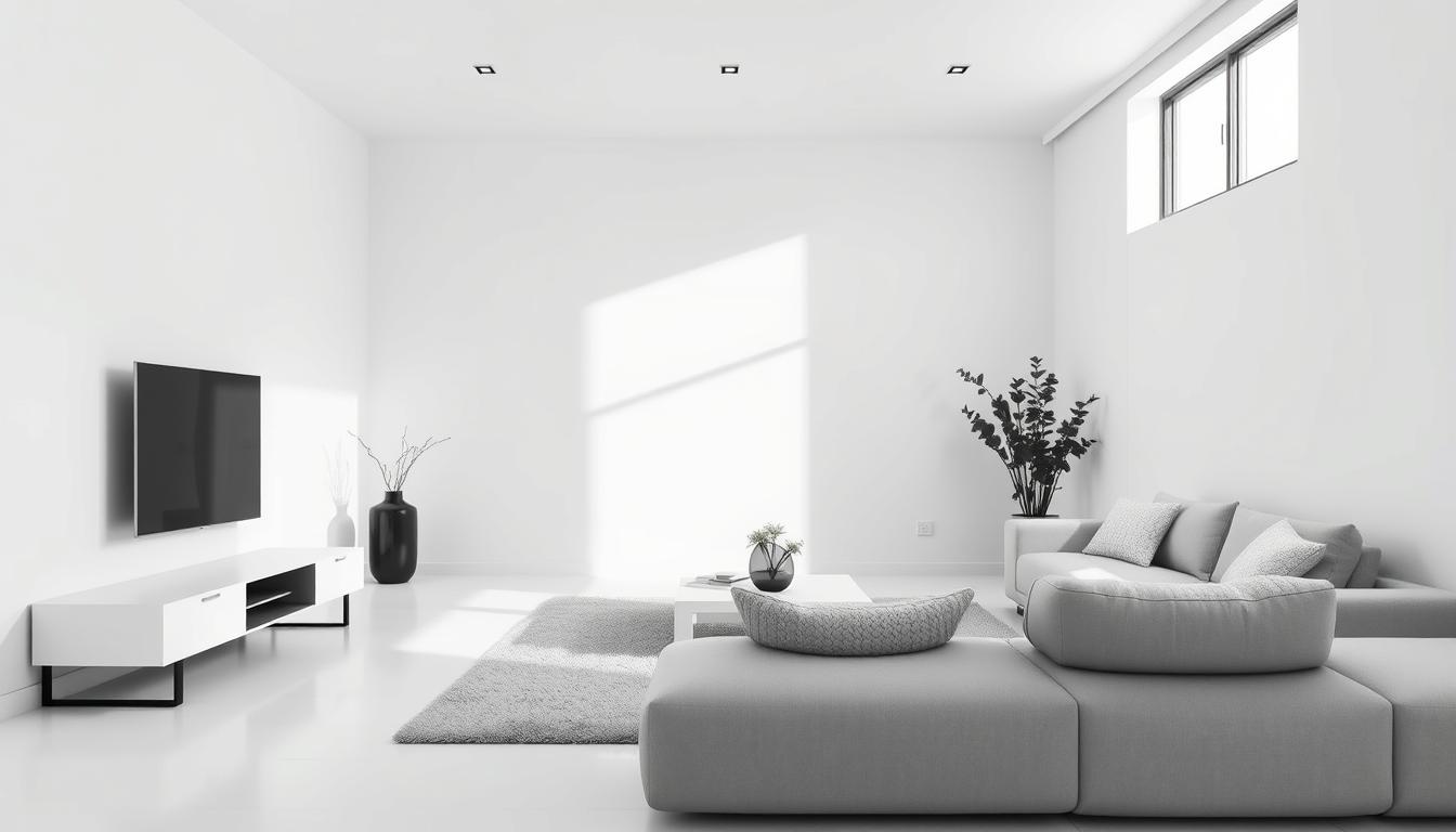
The Role of Neutrals in Home Interiors
Neutral colors are key in interior design. They make a space versatile and timeless. They also create a calm atmosphere, perfect for bold colors and patterns.
Types of Neutral Colors
Neutral colors go beyond just white and beige. They include grays, taupes, and soft pastels. These colors can be warm or cool. Warm neutrals like beige make a room cozy. Cool neutrals, such as gray, bring a calming feel.
| Type of Neutral | Examples | Effect on Room |
|---|---|---|
| Warm Neutrals | Beige, Taupe, Soft Cream | Cozy, Inviting |
| Cool Neutrals | Gray, Blue-Gray, Pale Lavender | Calming, Refreshing |
When to Use Neutrals
Neutrals are great for creating a unified look in your home. They work well in rooms with lots of natural light. They also make a perfect backdrop for your artwork and decor.
We suggest using neutrals in:
- Living rooms and bedrooms for a calm vibe.
- Spaces with lots of natural light to brighten up the area.
- Areas where you want to show off bold artwork or decor.
Accenting with Bold Colors
While neutrals are the foundation, bold colors can add excitement. Use them in furniture, rugs, throw pillows, or wall art. The trick is to balance bold colors with neutrals to keep the space interesting.

For example, a neutral wall can be paired with a bold sofa or art. This creates a focal point. Thoughtful use of bold accents can make your space unique and engaging.
Trends in Home Interior Color Schemes
The world of home interior colors is exciting, mixing bold and subtle shades. People want their homes to be both personal and welcoming. This balance is key in today’s design trends.
Current Color Trends in 2023
In 2023, home colors are all about contrasts. Earth tones and soft pastels calm the space. On the other hand, deep blues and rich greens bring elegance.
There’s also a big push for sustainable colors. People are choosing natural and organic hues to connect with nature.
Timeless Vs. Trendy Colors
Choosing between timeless and trendy colors is a big decision. Timeless colors are classic and never go out of style. Trendy colors, while bold, might need updating often.
A good strategy is to use timeless colors as a base. Then, add trendy colors through accents and decor. This way, you get the best of both worlds.
Regional Trends Across the US
Color schemes vary by region in the US. Coastal areas often use light, airy colors that remind us of the sea. Urban spaces, on the other hand, embrace bold, vibrant hues to express themselves.
| Region | Popular Colors | Influences |
|---|---|---|
| Coastal | Light blues, sandy neutrals | Sea, sky, natural surroundings |
| Urban | Bold reds, deep blacks | Urban landscape, cultural diversity |
| Rural | Earth tones, greens | Natural environment, agricultural heritage |
Knowing these regional trends helps homeowners make choices that fit their taste and surroundings. It’s all about finding the right balance.
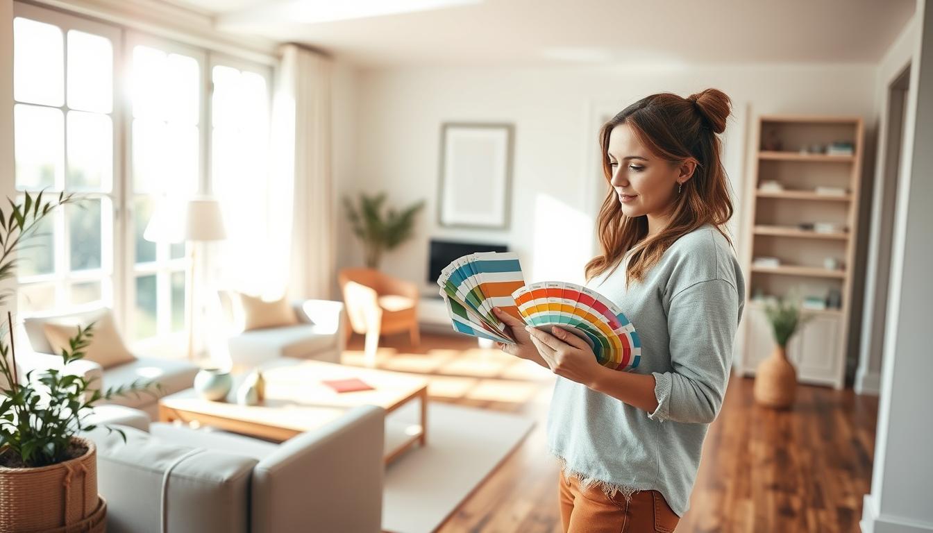
Practical Tips for Selecting Colors
Choosing the right colors for your home can feel overwhelming. We’re here to help you through it. Think about lighting, furniture, and decor when picking colors. Here are some tips to guide you in making the best choices for your home.
Testing Paint Samples
Testing paint samples is key to making sure the color works in your lighting. Paint a small wall section with the sample color. Watch how it looks at different times of day. This helps you see how the color will look in different lights.
- Choose a small area of the wall to test the paint sample.
- Observe the color at different times of the day.
- Consider how the color looks with your furniture and decor.

Considering Texture and Finish
The texture and finish of your paint greatly affect your home’s look. For example, a matte finish can hide wall imperfections, while glossy makes rooms brighter. When coordinating colors in home decor, think about the texture and finish of your paint.
Popular finishes include:
- Matte
- Eggshell
- Satin
- Glossy
Using Color Apps and Tools
Many color apps and tools can help you see different color combinations. They’re great for finding the best color combinations for home interiors. These tools are super useful when picking a color scheme.
Some popular color apps and tools include:
| Tool | Description |
|---|---|
| ColorSnap | A visual color-matching app that helps you find the perfect paint color. |
| Homestyler | A home design app that allows you to create 2D and 3D designs and test different color schemes. |
By following these tips, you can make smart choices when choosing paint colors for home. This way, you can create a beautiful, cohesive space that shows off your personal style.
Color Psychology in Home Interiors
The colors we pick for our homes can really affect our mood and actions. It’s key to know how different colors work on our minds. This helps make a home that feels good and is comfortable.
Colors That Promote Relaxation
Some colors help us relax and feel calm. Soft blues, pale greens, and neutral shades like beige and gray are great for bedrooms and bathrooms. They help lower stress and help us sleep better.
For example, soft blue can make a bedroom feel peaceful. Pale green brings balance and harmony, making a space feel relaxing.
Energizing Colors for Social Spaces
But, living rooms and dining areas need colors that make us want to talk and move. Warm colors like oranges, reds, and yellows make spaces lively and welcoming. They boost energy and encourage people to interact.
For instance, a warm orange can make a living room cozy and inviting. But, it’s important to mix these bold colors with neutral ones to keep the space balanced.
Using Warm and Cool Colors Effectively
It’s important to know the difference between warm and cool colors. Warm colors make us feel energized, while cool colors calm us down.
To get a good color mix, think about what each room is for and what mood you want. Mixing warm and cool colors can make your home look and feel great.
| Color Type | Emotional Impact | Suitable Rooms |
|---|---|---|
| Warm Colors (Reds, Oranges, Yellows) | Energizing, Stimulating | Living Rooms, Dining Areas |
| Cool Colors (Blues, Greens, Purples) | Calming, Soothing | Bedrooms, Bathrooms |
| Neutral Colors (Beige, Gray, White) | Balancing, Versatile | All Rooms |
By using color psychology, you can make your home not just look good but also feel good for your mind and heart.
Incorporating Patterns and Textures
Patterns and textures are more than just decorations. They are key to making a room look good and feel right. They add depth, interest, and personality.
To use patterns and textures well, we need to know how they work with colors and other design parts. We’ll look at how to match patterns with colors, mix textures, and how patterns change how we see color.
Patterns That Pair Well with Colors
Choosing the right patterns with your colors can make your design pop. For example, geometric patterns bring a modern vibe, while floral patterns add a classic elegance.
- Stripes help a room feel connected and flowing.
- Geometric patterns give a modern twist.
- Floral patterns add warmth and coziness.
When mixing patterns, balance them with your colors. A bold color can be softened by a subtle pattern. A soft color can be made bolder with a bold pattern.
Mixing Textures for Depth
Mixing textures adds depth and interest to a room. Combining smooth and rough, or matte and glossy, makes a space rich and engaging.
- Pair smooth with rough for contrast.
- Match matte with glossy for visual appeal.
- Use wood, metal, and fabric for variety.
For example, a smooth leather sofa with a chunky rug and a wooden table makes a welcoming space.
How Patterns Influence Perception of Color
Patterns can change how we see color in a room. A pattern can make a color seem brighter or darker, based on the colors around it and the pattern’s design.
A bold geometric pattern can make a single color seem lively and varied. A soft texture can make a color richer without overwhelming it.
Knowing how patterns and colors work together is crucial for a harmonious and appealing space. By picking patterns and colors that go well together, we can create interiors that are not just pretty but also engaging and useful.
Creating a Focal Point
A well-designed focal point can make any room look better. It draws the eye and adds interest. In interior design, a focal point acts as a visual anchor. It ties together different elements of a room, making it balanced and harmonious.
When designing a focal point, think about your home’s style and theme. For example, if you’re using popular home interior color schemes, pick a statement piece that matches these colors.
Choosing a Statement Color
One way to create a focal point is by picking a statement color. Choose a bold, contrasting color that grabs attention. For instance, a vibrant red or orange accent wall can stand out against calming neutrals.
When picking a statement color, look at interior design color palettes that are trending. You can also get inspiration from nature, art, or cultural themes for a unique color.
Using Artwork and Accessories
Artwork and accessories are great for creating a focal point. A large piece of art or decorative items can draw the eye and add personality. Choose items that complement your existing decor in terms of colors and textures.
A colorful rug can be a focal point and tie together different room elements. A bold-colored sofa or an intricately designed coffee table can be the centerpiece of your living room.
“The right piece of art can transform a room, making it feel more personal and inviting.” –
Balance Between Focal and Supporting Colors
A focal point should draw attention but be balanced with supporting colors. This balance creates harmony between the focal point and the decor. Use a mix of bold and neutral colors to ensure the focal point stands out without overwhelming the room.
| Focal Point Element | Supporting Colors | Overall Effect |
|---|---|---|
| Bold Red Accent Wall | Neutral Beige and Cream | Creates a striking contrast while maintaining a calm atmosphere |
| Vibrant Artwork | Soft Blues and Whites | Adds energy to the room while keeping the overall feel serene |
By carefully choosing a focal point and balancing it with supporting colors, you can create a visually appealing space. This space will reflect your personal style and use the best color combinations for home interiors.
Maintaining Consistency Across Rooms
To keep your home looking connected, it’s key to pick colors that flow well from room to room. It’s not just about choosing colors you like. It’s about creating a color scheme that links all areas together.
Developing a Color Palette
Creating a color palette is a big step in keeping rooms consistent. Start by picking a main color that shows your style and fits your home’s look. Then, pick 2-3 secondary colors that go well with your main color. Use the 60-30-10 rule: 60% of your main color, 30% of your secondary, and 10% of an accent color.
For example, if you love blues, choose navy blue as your main color. Light sky blue as your secondary, and crisp white as your accent. This palette can be used in different rooms, adjusting the colors based on the room’s purpose and light.
“The key to a successful interior design is not just about the colors you choose, but how you use them to create a flow that ties the entire space together.” –
Flow Between Different Spaces
It’s important to make sure rooms flow smoothly together. One way is to use a common color in nearby rooms, but change the shade or tone for interest. For example, if your living room has a blue-green palette, use a lighter version in the dining room next to it.
| Room | Primary Color | Secondary Color | Accent Color |
|---|---|---|---|
| Living Room | Navy Blue | Light Gray | Crisp White |
| Dining Room | Soft Blue | Cream | Gold |
| Kitchen | White | Navy Blue | Soft Blue |
Adjusting Colors for Different Applications
Different rooms and parts of your home might need different color palettes. For example, a bedroom might need softer colors for calm, while a home office might use brighter colors for focus. Think about the room’s purpose and how colors look under different lights.
When picking paint colors, remember the finish affects the color’s look. A matte finish looks different than a glossy one. Always test paint samples on walls before deciding.
By carefully choosing a color palette, making sure rooms flow well, and adjusting colors for each space, you can make your home look beautiful and cohesive.
Conclusion: Finding Your Unique Style
Your home should show off your personality and style. We’ve looked at how picking the right colors is key to making your space special. By learning about color psychology and trying out different colors, you can create a unique vibe that feels just right for you.
Personalizing Your Space
When picking colors for your home, think about how they make you feel. Do you like calm neutrals or bold colors? Your home’s colors should show who you are, making it a cozy and inspiring place.
Evolving with Time
As your tastes change, your home’s colors can too. It’s okay to change colors to keep your space feeling new and exciting. This guide helps you make smart choices as you grow your personal style.
A Lasting Resource
Using what we’ve covered, you’ll be ready to create a beautiful home that lasts. Whether you love classic neutrals or the latest colors, knowing color psychology helps you choose wisely. This makes your living space even better.