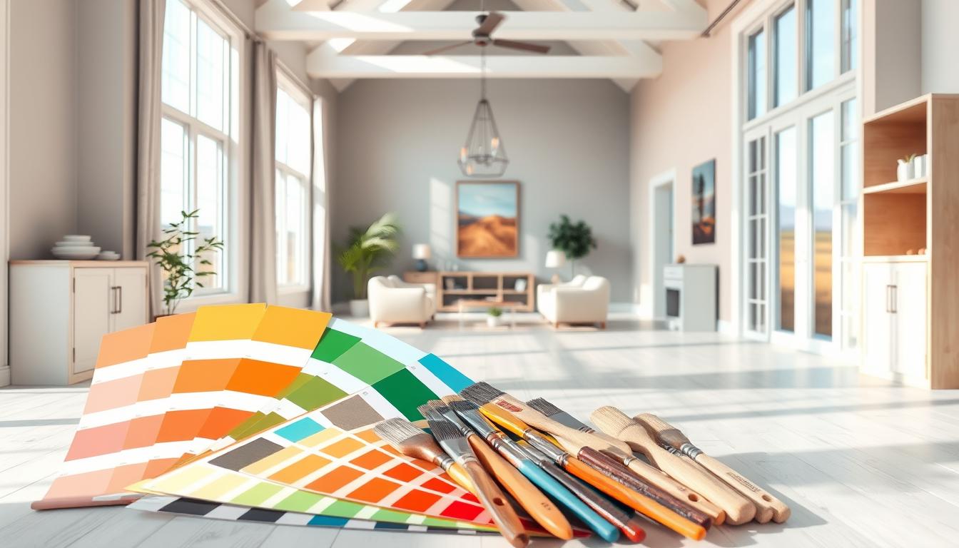
Did you know that the colors in your home’s interior can really affect your mood? They also change how your living space feels. Finding the right colors can seem hard, but our guide will help you. You’ll learn how to make your home look beautiful and consistent.
Choosing the best colors for your home takes thought. You need to think about the light, your furniture, and what you like. We’ll show you how to pick colors that work well together. You’ll get tips to help you choose colors that match your style.
Key Takeaways
- Understand the impact of colors on mood and ambiance
- Learn how to choose colors that complement your furniture and decor
- Discover the importance of natural lighting in color selection
- Get expert tips on creating a cohesive color scheme
- Explore the role of personal preferences in choosing interior colors
Understanding the Psychology of Color
Colors greatly affect our emotions and actions in interior design. They can change our mood, energy, and even what we eat. Knowing the psychology of colors helps us pick the right paint for our homes.
How Colors Affect Mood
Different colors trigger different feelings. For example, blue brings calmness and peace, perfect for bedrooms. Red, on the other hand, boosts energy and passion, great for living areas or gyms. This knowledge helps us choose colors that match the mood we want in each room.
Here’s a quick look at how colors impact our mood:
| Color | Emotional Response | Suitable Room |
|---|---|---|
| Blue | Calmness, Serenity | Bedroom |
| Red | Energy, Passion | Living Room, Home Gym |
| Green | Balance, Harmony | Living Room, Office |
The Impact of Warm and Cool Tones
Colors fall into warm and cool categories, each affecting us differently. Warm colors like orange and yellow feel cozy and comforting. Cool colors, such as blue and green, bring calm and relaxation.
Choosing between warm and cool colors depends on your home’s lighting and the mood you want. Warm colors add coziness, perfect for dimly lit areas. Cool colors make rooms feel spacious and airy.
Popular Interior Color Trends
Keeping up with the latest interior color trends can be tough. But our guide is here to guide you through. We’ll look at the popular home interior colors that are hot in 2023 and the classics that never go out of style.
2023 Color Trends to Consider
This year, we’re seeing a shift towards colors that reflect our personalities and create harmony. The top trends include:
- Soft, muted tones for calm and serenity
- Rich, earthy colors for warmth and depth
- Bold, vibrant hues for energy and statement
These trends are about more than looks. They’re about setting a mood or atmosphere in your home. For example, soft blues and greens calm the space. Bold reds and oranges energize it.
Timeless Classics That Never Fade
While trends change, some colors stay popular forever. These timeless classics are versatile, elegant, and fit any design. Some favorites include:
- Neutral shades like beige, cream, and gray for a clean look
- Classic whites and creams for sophistication
- Deep, rich woods for warmth and character
These colors are great as a base. They let you add trendier colors through accessories and decor. This makes it easy to update your space as trends change.
By mixing the latest trends with timeless classics, you can create a space that’s uniquely yours. Whether you’re updating one room or your whole home, knowing the current color trends is crucial. It helps you achieve a beautiful and harmonious living space.
Choosing Colors for Different Rooms
Choosing the right interior house paint colors is key. Each room has its own role. The colors you pick can change how a room feels and works.
Living Room Color Tips
The living room is where families and friends gather. Pick warm, inviting interior house paint colors for a cozy feel. Beige, soft grays, or warm neutrals are great choices.
If you want something bold, try rich jewel tones like emerald green or navy blue. They add depth and style.
Bedroom Color Recommendations
Bedrooms are your personal retreat. For a calm space, choose soothing interior house paint colors. Light blues, pale lavenders, or muted greens are good choices.
They help you sleep better. For a bold look, use deeper colors like charcoal or plum. But pair them with lighter colors to keep the room balanced.
Kitchen and Dining Area Palette Ideas
Kitchens and dining areas are for meals and memories. Pick interior house paint colors that are welcoming and easy to clean. Warm whites, creamy yellows, or soft oranges are perfect.
For a modern vibe, bold colors like red or turquoise work well. Just use them wisely to avoid too much color.
When picking interior house paint colors, think about the room’s use, natural light, and furniture colors. This way, you create a space that’s both beautiful and functional, showing off your style.
Taking Light Into Account
When picking trending interior colors, think about how they look in different lights. Lighting greatly changes how colors appear in your home. It’s a key thing to think about when making your choices.
Natural Light vs. Artificial Light
Natural light shows colors as they really are, while artificial light can change them. For example, warm artificial light can make cool colors seem less bright. On the other hand, cool-toned lighting can make warm colors less vibrant.
Key differences between natural and artificial light:
- Natural light changes throughout the day, affecting color appearance.
- Artificial light can be controlled but may not always accurately represent true colors.
- Combining both types of light can create a unique and inviting atmosphere.

Choosing Colors for Dark Spaces
Choosing colors for rooms with little natural light can be tough. But, there are ways to make dark spaces look brighter and more welcoming.
Tips for dark spaces:
- Opt for lighter shades that reflect available light.
- Use cool-toned colors to create a sense of brightness.
- Avoid dark, rich colors that can make a room feel even darker.
Understanding how lighting affects your chosen colors helps you make better choices. This way, you can make your home more beautiful and functional.
Creating a Color Palette
A well-designed color palette can change your home’s feel and look. Making a cohesive color scheme is key for a beautiful home. We’ll look at how to make a balanced color palette that shows your style.
The 60-30-10 Rule Explained
The 60-30-10 rule is a classic decorating tip. It says to use 60% of a main color, 30% of a secondary color, and 10% of an accent color. This rule makes your space look balanced and nice.
To use this rule, pick a main color for 60% of the room, like the walls. Then, choose a secondary color for 30% of the space, like furniture and rugs. Lastly, select an accent color for 10% of the room, for things like decorations.
Complementary and Contrasting Colors
Knowing how to use complementary and contrasting colors is important. Complementary colors are pairs like blue and orange, opposite each other on the color wheel. They add depth and energy to a room.
Contrasting colors use different shades or tones to create interest. For example, light and dark shades of the same color can look sophisticated. But, it’s important to balance contrasting colors to avoid too much.
By following the 60-30-10 rule and using complementary and contrasting colors wisely, you can make a unique and beautiful color scheme. This will make your home even more stunning.
Planning for Flow and Continuity
A beautiful home interior starts with flow and continuity. When different areas connect visually, it brings harmony and beauty. Color selection plays a big role in achieving this.
Choosing colors for open floor plans is tricky. An open floor plan combines living areas into one space. You need a color scheme that ties everything together.
Open Floor Plans and Color Choices
When picking colors for an open floor plan, think about each area’s function. You might want to make the kitchen, dining, and living areas look different yet unified. Use a common base color and add accent colors that vary slightly.
For example, use beige or gray as the base color for most of the space. Then, add different accent colors for each area. This adds interest and defines each space without breaking the flow.
Ensuring Harmony Between Rooms
In homes with separate rooms, harmony is key. Use a consistent color palette with slight variations to differentiate rooms. A common color in each room helps create continuity.
| Room | Base Color | Accent Color |
|---|---|---|
| Living Room | Soft Gray | Blue |
| Kitchen | Soft Gray | Yellow |
| Dining Room | Soft Gray | Green |
By using a consistent base color and varying accent colors, you can create harmony between rooms. This method lets you personalize each space while keeping the overall design cohesive.
Testing Colors Before Committing
Choosing the right color is key to a great interior design. It’s important to test colors before deciding. This ensures the color fits the space and creates the right mood.
Paint samples are very useful for testing colors. They let you see how the color will look on your walls before buying more.
Using Paint Samples Effectively
To make the most of paint samples, follow these tips:
- Apply the paint sample to a big area of the wall to see the color right.
- Look at the color at different times of day to see how it changes with light.
- Check how the color looks with your furniture and decor to make sure it matches.
Don’t just rely on the color chip. The actual paint can look different on a bigger surface. Testing the paint sample helps avoid expensive mistakes and makes sure the color fits your space.
Tools for Visualizing Your Space
There are also tools to help you see how your space will look. These include:
- Online color picker tools that let you test colors on a photo of your room.
- Interior design apps with lots of colors and styles to choose from.
These tools are really helpful if you’re not sure about a color or want to try different shades without painting.
Using paint samples and these tools helps you make a better choice. You can pick a modern interior color trend that shows off your style.
Considering Personal Style
The colors you pick for your home show off your personal style. They affect the mood and feel of your space. When picking interior home colors, think about the vibe you want to create.
Your style is a mix of what you like, how you live, and your experiences. It makes your home special. Choosing interior color ideas depends on whether you like modern, traditional, or a mix.
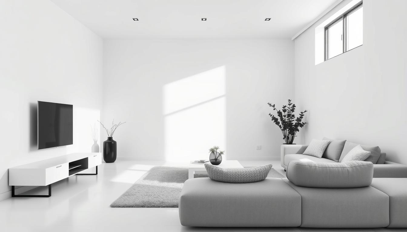
Modern vs. Traditional Aesthetics
Modern homes often have bold, simple colors. Neutrals like whites, grays, and blacks are common. They give a clean, elegant look.
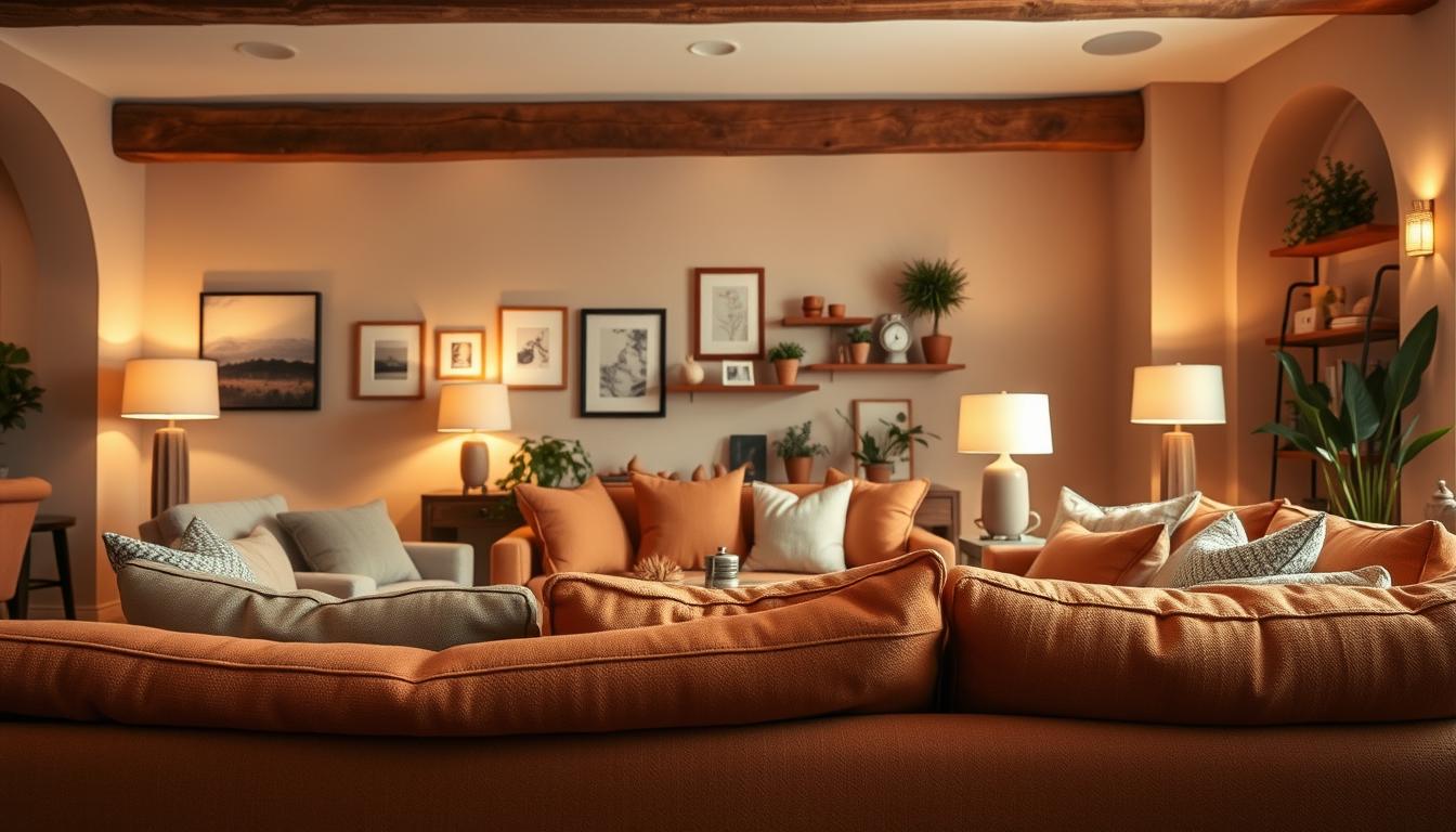
Traditional homes, on the other hand, use warmer colors. Think earth tones, deep reds, and golden yellows. These colors make a space feel cozy and welcoming.
Choosing between modern and traditional depends on your lifestyle and home’s style. Modern colors work well in bright, contemporary homes. Traditional colors suit classic or vintage homes better.

Incorporating Your Unique Taste
Adding your unique taste to your home’s colors is more than just picking favorites. It’s about creating a look that shows your personality. Start by picking colors you love and see how they fit in your home.
Using a mix of colors you love can work well. For example, bold colors can be used as accent walls or in decor. Keep main areas more neutral.
The best way to choose interior home colors is to stay true to your style. But also think about how colors look in different lights and how they make you feel.
Seasonal Color Changes
Every season brings a chance to update your home’s colors. This keeps your space feeling new and welcoming. You can use trending interior colors and popular home interior colors to refresh your decor.
Ideas for Refreshing Your Space
Start by adding seasonal colors with throw pillows, blankets, and vases. In spring, try pastel shades and floral patterns for a lively feel. Winter might be the time for warmer colors and soft textures.
Remember the 60-30-10 rule for a balanced look. This means 60% of your room is a main color, 30% a secondary, and 10% an accent. It makes your space look good and feel right.
Transitioning Colors with the Seasons
Changing your colors with the seasons is easy. Just switch to lighter shades in summer and darker ones in winter. Here’s a simple guide to help you:
| Season | Color Palette | Accent Colors |
|---|---|---|
| Spring | Pastel shades, whites, creams | Floral patterns, greens |
| Summer | Brights, corals, blues | Yellows, oranges, natural textures |
| Autumn | Earth tones, oranges, reds | Gold, bronze, deep berry shades |
| Winter | Deep blues, purples, silvers | Charcoal, icy blues, metallics |
By following these tips, your home will stay stylish all year. You’ll get to use the latest trending interior colors and popular home interior colors.
Maintenance and Durability of Colors
When picking the best interior paint colors for your home, think about how easy they are to maintain. The right finish and color can greatly affect your walls’ look and how long they last.
Selecting the Right Finish
Choosing the right paint finish is key to keeping your walls looking good for years. Finishes like flat, eggshell, satin, and semi-gloss vary in durability and shine. Think about how much each room is used when picking a finish.
Color and Perceived Cleanliness
The color you pick can also make your home look cleaner. Lighter colors can make a room seem cleaner, while darker colors can show dirt and stains more. Choose colors that hide dirt and stains well, based on how much upkeep you’re willing to do.